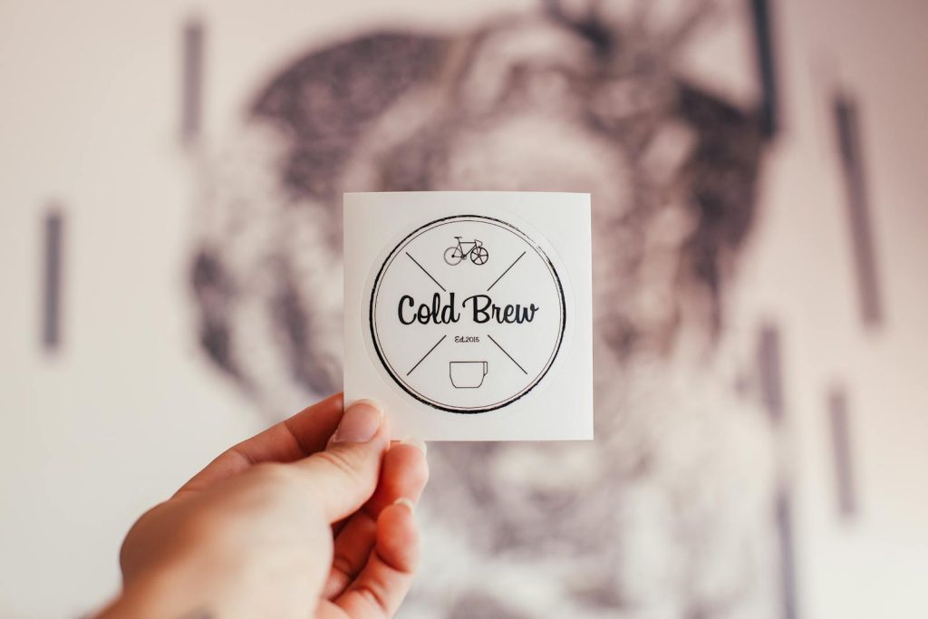
Creating a logo is a critical step in establishing a brand’s identity. A well-designed logo can help convey your brand’s values, attract customers, and create a lasting impression. However, many beginners make common mistakes that can undermine their logo’s effectiveness. This guide outlines key pitfalls to avoid, ensuring your logo design process is smooth and successful.

1. Ignoring Brand Identity
One of the most significant mistakes is failing to align the logo with the brand’s identity. Before starting the design process, it’s essential to define your brand’s values, mission, and target audience. A logo that doesn’t reflect the brand can lead to confusion and misinterpretation. Take the time to understand what your brand stands for, and let that guide your design choices.
2. Overcomplicating the Design
Simplicity is key in logo design. A cluttered logo with too many elements can be overwhelming and difficult to recognize. Great logos are often simple yet memorable, allowing for easy reproduction across various mediums. Aim for a clean design that can be easily scaled and recognized, whether on a business card or a billboard.
3. Relying on Trends
While it’s tempting to follow design trends, they can quickly become outdated. A trendy logo may lose relevance in a short time, necessitating a redesign. Instead, focus on timeless design principles that will ensure your logo remains effective for years to come. Consider classic design elements that convey your brand’s essence without falling victim to fleeting trends.
4. Poor Typography Choices
Typography plays a crucial role in logo design. Choosing the wrong font can send the wrong message about your brand. Avoid overly decorative or hard-to-read fonts, especially for logos that need to convey professionalism. Instead, opt for fonts that are clean, legible, and reflective of your brand’s personality. Mixing too many font styles can also create visual chaos; stick to one or two complementary typefaces.
5. Neglecting Scalability
Your logo will be used in various sizes and formats, from small icons on social media to large banners. If a logo is not designed with scalability in mind, it may lose its integrity when resized. Ensure that your design remains recognizable and legible at any scale. Test your logo at different sizes to ensure it retains its visual impact.
6. Choosing Inappropriate Colors
Color choice is pivotal in logo design, as colors evoke emotions and associations. Beginners often choose colors based on personal preference rather than their psychological impact. Research color theory and consider what emotions different colors evoke in your target audience. Additionally, ensure that your logo works well in both color and monochrome versions for versatility.
7. Forgetting About Versatility
A logo should work across various platforms and mediums. Consider how it will look in print, on the web, and in different backgrounds. A versatile logo is one that can adapt to different contexts without losing its identity. Avoid overly detailed designs that may not reproduce well in certain applications.
8. Not Seeking Feedback
Designing in a vacuum can lead to missed opportunities for improvement. Seek feedback from peers, potential customers, or design professionals throughout the process. Constructive criticism can provide valuable insights that help refine your logo. Be open to suggestions and ready to make adjustments based on feedback.
9. Skipping the Research Phase
Before diving into design, conduct thorough research on competitors and industry standards. Understanding what works and what doesn’t in your field can inform your design choices. Analyze logos from similar brands to identify common elements and differentiate your logo from competitors.
10. Failing to Create Variations
A single logo may not suffice for all brand applications. Consider creating variations of your logo for different contexts, such as a simplified version for small-scale use or a monochrome version for print. Having a suite of logos can enhance your branding flexibility and ensure consistent representation across various platforms.
Conclusion
Avoiding these common logo design mistakes can significantly enhance the effectiveness of your branding efforts. By focusing on brand identity, simplicity, scalability, and versatility, you can create a logo that resonates with your audience and stands the test of time. Remember, a well-designed logo is not just a pretty image; it’s a powerful tool that communicates your brand’s values and connects with your customers. Take your time, seek feedback, and embrace the design process to achieve a logo that truly represents your brand.
