The Role of Color in Effective Branding Strategies

Person Holding White and Red Love Print CardColor is an essential component of branding, influencing not only how a brand is perceived but also how it connects with its audience. The psychology of color can evoke emotions, create associations, and guide consumer behavior. Understanding the role of color in branding is crucial for businesses aiming to establish a strong and memorable identity. Here’s a detailed exploration of how color contributes to effective branding strategies.

1. Establishing Brand Identity

Color plays a fundamental role in establishing a brand’s identity. The choice of color can convey a brand’s values, mission, and personality. For instance, a tech company might opt for blue to communicate trust and reliability, while a health-focused brand may choose green to emphasize wellness and sustainability. Consistent use of color helps solidify a brand’s identity in the minds of consumers, making it easily recognizable across various platforms.

2. Evoking Emotions and Associations

Colors can evoke specific emotions and associations that resonate with consumers. Research shows that different colors can trigger various psychological responses. For example:

  • Red: Stimulates excitement and urgency, often used in sales promotions.
  • Blue: Conveys calmness and security, commonly employed by financial institutions.
  • Yellow: Evokes optimism and cheerfulness, effective for brands targeting a youthful audience.
  • Black: Represents sophistication and luxury, popular among high-end brands.

By understanding these associations, brands can select colors that align with the emotions they wish to evoke in their audience.

3. Enhancing Brand Recognition

Brands that use consistent color schemes are more easily recognized by consumers. A well-defined color palette helps create a cohesive look across all marketing materials, from logos to packaging and advertising. Consistency in color usage strengthens brand recognition, as consumers begin to associate specific colors with particular brands. For instance, think of Coca-Cola’s red or Tiffany & Co.’s iconic blue; these colors are instantly recognizable and deeply connected to the brand identity.

4. Differentiating from Competitors

In a crowded marketplace, color can be a key differentiator. Choosing a distinctive color palette can help a brand stand out among its competitors. For example, while many tech brands use blue tones, a company might choose a bold orange or green to set itself apart. By employing unique colors that resonate with the target audience, brands can carve out a niche and create a memorable identity.

5. Influencing Consumer Behavior

Color can significantly influence consumer behavior, guiding purchasing decisions and brand loyalty. Research indicates that up to 90% of snap judgments about products are based on color alone. Brands can strategically use color to enhance their marketing efforts:

  • Call to Action (CTA): Using contrasting colors for CTA buttons can make them more prominent, encouraging clicks and conversions.
  • Packaging Design: The right color choice in packaging can attract attention on store shelves, influencing impulse purchases.
  • Seasonal Promotions: Adapting colors for seasonal marketing campaigns can create a sense of relevance and urgency.

6. Creating a Brand Narrative

Colors can help tell a brand’s story and enhance its narrative. For instance, a brand focused on eco-friendliness might incorporate earthy tones to reflect its commitment to sustainability. A luxury brand might use deep, rich colors to communicate exclusivity and sophistication. By carefully selecting colors that align with the brand’s message, businesses can create a cohesive narrative that resonates with consumers.

7. Adapting to Cultural Contexts

Color meanings can vary across cultures, making it essential for brands to consider cultural context when developing their color strategies. For example, while white signifies purity in Western cultures, it may represent mourning in some Eastern cultures. Understanding these nuances ensures that a brand’s color choices do not unintentionally offend or alienate potential customers.

Conclusion

The role of color in effective branding strategies cannot be overstated. From establishing a brand identity to influencing consumer behavior and enhancing recognition, color is a powerful tool that shapes how a brand is perceived. By understanding the psychological impact of color and strategically incorporating it into branding efforts, businesses can create strong, lasting connections with their audience. As trends and consumer preferences evolve, brands must remain adaptable and mindful of color’s role in shaping perceptions and driving engagement. Ultimately, mastering the art of color in branding can lead to greater success and a more profound impact on consumers.

Color Combinations: Creating Harmony in Design

In the world of design, color is more than just a visual element; it’s a powerful tool that can evoke emotions, set moods, and influence perceptions. Mastering color combinations is essential for any designer, whether you’re working on branding, interior design, fashion, or graphic design. This article explores the principles of color harmony, effective combinations, and practical tips for creating visually appealing designs.

Healthcare Text Screenshot Near Green Fern Leaf

Understanding Color Harmony

Color harmony refers to the pleasing arrangement of colors that creates a sense of balance and unity in a design. When colors work well together, they enhance each other and contribute to an overall aesthetic that is both attractive and functional. Several key principles can guide you in achieving color harmony:

  1. Color Wheel Basics: The color wheel is a fundamental tool for understanding color relationships. It consists of primary colors (red, blue, yellow), secondary colors (green, orange, purple), and tertiary colors. Understanding how these colors interact is crucial for creating harmonious combinations.
  2. Color Schemes: There are several established color schemes that designers can use to create harmony:
    • Monochromatic: This scheme uses variations in lightness and saturation of a single color. It creates a cohesive and calming effect.
    • Analogous: This scheme involves colors that are next to each other on the color wheel. It provides a rich, harmonious look by blending similar hues.
    • Complementary: This scheme combines colors that are opposite each other on the wheel. The high contrast can create vibrant and dynamic designs.
    • Triadic: This scheme uses three evenly spaced colors on the color wheel. It offers a balanced yet lively combination.

Effective Color Combinations

Selecting the right color combinations can elevate your design, making it more engaging and effective. Here are some popular color combinations that work well together:

  1. Blue and Orange: This complementary pairing is energetic and vibrant. Blue conveys trust and professionalism, while orange adds warmth and enthusiasm, making it suitable for brands that want to appear approachable yet reliable.
  2. Green and Brown: These analogous colors evoke a sense of nature and sustainability. Green represents growth and health, while brown adds an earthy, grounded feel. This combination is ideal for organic brands and eco-friendly products.
  3. Purple and Gold: This regal combination exudes luxury and sophistication. Purple is often associated with creativity and wisdom, while gold adds a touch of elegance and opulence. This pairing is effective in high-end branding and premium products.
  4. Black and White: A classic monochromatic scheme, black and white offer timeless elegance and versatility. This combination is perfect for minimalist designs and allows for strong contrasts that can enhance visual impact.
  5. Pastels: Soft pastel colors, such as light pink, mint green, and baby blue, create a gentle and soothing palette. These colors are often used in designs for children, wellness brands, or anything associated with calmness and tranquility.

Tips for Creating Harmonious Color Combinations

  1. Limit Your Palette: While it might be tempting to use many colors, sticking to a limited palette (three to five colors) can enhance harmony. Too many colors can overwhelm the viewer and dilute your message.
  2. Consider Context: Think about the context in which your colors will be viewed. Lighting, surrounding elements, and cultural significance can all affect how colors are perceived.
  3. Use Tools and Resources: Utilize online tools like Adobe Color, Coolors, or Canva’s color palette generator to experiment with color combinations and visualize how they interact.
  4. Test Your Combinations: Before finalizing your design, create mockups to see how your chosen colors work in practice. Gather feedback from peers or target audience members to ensure the combinations resonate.
  5. Stay Consistent: Once you’ve chosen your color combinations, apply them consistently across all branding materials and platforms. Consistency helps reinforce your brand identity and enhances recognition.

Conclusion

Creating harmonious color combinations is essential for effective design. By understanding color theory, exploring different schemes, and carefully selecting your palette, you can enhance your designs and create a powerful emotional connection with your audience. Whether you’re designing a brand, a product, or a visual experience, the right color combinations will help you achieve harmony, clarity, and visual appeal. Embrace the power of color and let it guide your creative process, leading to designs that not only look great but also communicate your intended message effectively.

Understanding Color Psychology: How Colors Affect Emotions

Color is an integral part of our daily lives, influencing our moods, perceptions, and even behaviors. In branding and design, understanding color psychology can be the key to creating compelling visuals that resonate with audiences. This article delves into the significance of colors and their emotional associations, providing insights for designers and marketers alike.

A Counselor Listening to a Married Couple Marital Problems

The Basics of Color Psychology

Color psychology is the study of how colors impact human emotions and behaviors. Different colors can evoke specific feelings and reactions, making them powerful tools in branding and design. For example, warm colors like red, orange, and yellow tend to evoke feelings of warmth and energy, while cool colors like blue, green, and purple can elicit calmness and tranquility.

Warm Colors: Energy and Excitement

Warm colors are often associated with feelings of warmth, comfort, and energy. Red, for instance, is known for its ability to stimulate and energize. It can increase heart rates and create a sense of urgency, making it a popular choice for brands looking to capture attention quickly, such as in sale announcements or fast-food marketing.

Orange combines the energy of red with the cheerfulness of yellow. It’s often used to create a sense of enthusiasm and encouragement. Brands like Fanta and Home Depot use orange effectively to convey a playful yet trustworthy image.

Yellow, the brightest color, is often linked to happiness and optimism. However, it can also be overwhelming if overused. Brands such as McDonald’s utilize yellow to create a sense of friendliness and approachability.

Cool Colors: Calm and Trust

Cool colors, on the other hand, tend to have a calming effect. Blue is widely recognized as a color of trust and reliability. This is why many banks and tech companies, like PayPal and Facebook, choose blue in their branding. It conveys a sense of stability and professionalism.

Green is associated with nature, health, and tranquility. It can evoke feelings of balance and harmony. Brands like Whole Foods and Starbucks use green to promote their commitment to organic and sustainable practices.

Purple, often linked to luxury and sophistication, can also convey a sense of creativity. Companies like Yahoo! and Crown Royal effectively use purple to establish an upscale, imaginative brand identity.

The Psychological Impact of Color Combinations

While individual colors have distinct meanings, the combination of colors can significantly alter perceptions. For example, the combination of blue and green can evoke feelings of calmness and stability, while red and yellow together can create a sense of excitement and urgency.

Designers often use color harmony techniques, such as complementary, analogous, and triadic color schemes, to create visually appealing designs that also evoke desired emotions. Understanding how different colors interact can enhance the overall effectiveness of a brand’s message.

Cultural Considerations in Color Psychology

It’s crucial to consider cultural differences when applying color psychology. Colors can have varying meanings in different cultures. For instance, white is often associated with purity in Western cultures, while in some Eastern cultures, it symbolizes mourning. Brands operating in global markets must be aware of these cultural nuances to avoid miscommunication or offense.

Practical Applications in Branding and Marketing

Incorporating color psychology into branding strategies can yield significant results. Here are a few practical applications:

  1. Logo Design: A logo is often the first impression of a brand. Choosing the right color can help convey the intended message effectively.
  2. Website Design: The color scheme of a website can impact user experience. Calming colors may be suitable for wellness sites, while energetic colors might be better for fitness brands.
  3. Marketing Materials: Understanding the emotional response elicited by colors can help tailor marketing campaigns. For instance, using red in sales promotions can create a sense of urgency, encouraging immediate action.
  4. Product Packaging: The colors used in product packaging can influence purchasing decisions. Bright colors may attract attention, while muted tones can convey sophistication.

Conclusion

Color psychology plays a vital role in branding and design, influencing emotions and perceptions in profound ways. By understanding the emotional associations of different colors and their combinations, designers and marketers can create compelling visuals that resonate with their target audience. As brands continue to compete for attention in a crowded marketplace, leveraging the power of color can lead to more effective communication and stronger connections with consumers. Whether you’re designing a logo, developing a website, or crafting marketing materials, the strategic use of color can enhance your brand’s message and impact.

From RGB to CMYK: Understanding Color Models in Design

Color is an essential aspect of design, influencing aesthetics, branding, and user experience. However, not all colors are created equal; different color models serve distinct purposes and applications in the design world. Two of the most commonly used color models are RGB (Red, Green, Blue) and CMYK (Cyan, Magenta, Yellow, Black). Understanding these models is crucial for designers, as it directly impacts how colors are rendered across different mediums. This article delves into the characteristics, uses, and differences between RGB and CMYK, equipping designers with the knowledge needed to make informed color choices.

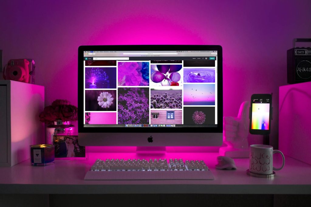
Silver Imac Displaying Collage Photos

What is RGB?

Overview of RGB

The RGB color model is an additive color model used primarily for digital screens, such as monitors, televisions, and smartphones. In this model, colors are created by combining varying intensities of red, green, and blue light. When these colors are mixed together at full intensity, they produce white light. Conversely, the absence of all three colors results in black.

How RGB Works

The RGB model operates on a scale of 0 to 255 for each color channel. This means that each color can be represented by a combination of values across three channels:

  • Red: 0-255
  • Green: 0-255
  • Blue: 0-255

For example, pure red is represented as (255, 0, 0), while white is (255, 255, 255), and black is (0, 0, 0). This model allows for over 16 million possible color combinations, making it highly versatile for digital design.

Applications of RGB

RGB is the preferred color model for any design intended for digital display. This includes web design, user interfaces, video production, and digital art. Designers utilize RGB to ensure that their creations appear vibrant and accurate on screens, where light is emitted rather than reflected.

What is CMYK?

Overview of CMYK

In contrast to RGB, the CMYK color model is a subtractive color model used primarily for print media. CMYK stands for Cyan, Magenta, Yellow, and Key (Black). This model works by subtracting varying percentages of light absorbed by the inks used in printing. When combined, these colors absorb light and produce a wide range of colors.

How CMYK Works

The CMYK model uses percentages to represent the intensity of each color channel, typically ranging from 0% to 100%. For example:

  • Cyan: 0%-100%
  • Magenta: 0%-100%
  • Yellow: 0%-100%
  • Key (Black): 0%-100%

When all four colors are combined at full intensity (100%), they ideally produce black. However, in practice, this often results in a muddy brown, which is why black ink is used as a separate component to enhance depth and contrast in printed materials.

Applications of CMYK

CMYK is the standard color model for any design intended for print, including brochures, posters, business cards, and packaging. When preparing files for print, designers must ensure that colors are accurately converted from RGB to CMYK to achieve the desired print results.

Key Differences Between RGB and CMYK

Color Production

The most significant difference between RGB and CMYK lies in how colors are produced. RGB is additive, meaning that colors are created by adding light together, resulting in brighter and more vibrant hues. CMYK, on the other hand, is subtractive, where colors are produced by absorbing light, often leading to darker and more muted tones.

Usage Context

As previously mentioned, RGB is primarily used for digital designs, while CMYK is suited for print. Understanding this distinction is crucial for designers, as using the wrong color model can lead to unexpected results. For example, a vibrant blue seen on a computer screen may appear dull and washed out when printed in CMYK.

Color Range

RGB has a broader color gamut than CMYK. This means that RGB can produce more colors than CMYK, especially bright and saturated hues. When converting from RGB to CMYK, designers may encounter limitations, resulting in some colors appearing differently in print than they do on screen.

Conversion Considerations

When preparing designs for print, it is essential to convert RGB colors to CMYK accurately. This process may require adjustments to ensure that colors remain true to the original vision. Design software like Adobe Photoshop or Illustrator provides tools for color conversion, allowing designers to visualize how their colors will translate into print.

Best Practices for Designers

  1. Start with the End Medium in Mind: Always consider whether your design will be displayed digitally or printed. Starting in the appropriate color model can save time and prevent color issues later in the process.
  2. Use Color Profiles: When working in design software, utilize ICC color profiles to maintain consistency in color representation across devices and outputs.
  3. Test Print Samples: If possible, create test prints of your designs to see how colors appear in the final product. This practice allows for necessary adjustments before the final print run.
  4. Stay Informed About Color Theory: Understanding the fundamentals of color theory will enhance your ability to choose colors effectively, regardless of the medium.

Conclusion

Understanding the differences between RGB and CMYK is essential for any designer looking to create effective and visually appealing work. By recognizing the characteristics, applications, and limitations of each color model, designers can make informed decisions that enhance the quality and impact of their designs. Whether you’re crafting digital experiences or preparing print materials, mastering these color models will ultimately lead to more successful and cohesive visual communication.

Exploring the Cultural Significance of Colors Around the World

Colors play a vital role in cultural expression and symbolism, influencing art, fashion, and even social customs. Each culture has its own unique associations and meanings for different colors, which can significantly shape perceptions and behaviors. Understanding the cultural significance of colors can foster deeper connections and respect among diverse communities. Here’s an exploration of how various colors are perceived across different cultures around the world.

temple, night view, yakushiji temple

1. Red: Power and Passion

In many cultures, red is a color associated with strong emotions. In China, red symbolizes good fortune, joy, and celebration, making it a popular choice for weddings and festivals. Conversely, in some Western cultures, red can signify danger or warning, as seen in traffic signals. Additionally, red is often linked to passion and love, making it a common choice for romantic gestures and occasions.

2. Blue: Trust and Tranquility

Blue often evokes feelings of calmness and serenity. In many Western societies, blue is associated with trust and professionalism, which is why it’s frequently used in corporate branding. In contrast, in parts of the Middle East, blue is believed to ward off evil spirits and bring protection. In Hindu culture, blue is linked to the divine, representing deities like Krishna.

3. Yellow: Joy and Caution

Yellow is typically associated with happiness and positivity. In many cultures, it symbolizes warmth, sunshine, and cheerfulness. However, it also carries dual meanings; for instance, in some countries, yellow is used as a cautionary color, indicating warning signs. In India, yellow is considered auspicious and is often worn during festivals and celebrations.

4. Green: Nature and Growth

Green is universally linked to nature, fertility, and growth. In many cultures, it symbolizes renewal and life. In Islamic culture, green holds special significance as it is associated with paradise and is often used in religious contexts. Conversely, in some Western cultures, green can also signify jealousy or inexperience, as seen in the phrase “green with envy.”

5. Black: Elegance and Mourning

Black carries complex meanings across cultures. In Western societies, it is often associated with sophistication and elegance, making it a popular choice for formal attire. However, black is also linked to mourning and death in many cultures. In contrast, in some African cultures, black symbolizes maturity and masculinity, reflecting strength and resilience.

6. White: Purity and Peace

White is frequently associated with purity, innocence, and peace. In many Western cultures, it is the traditional color for weddings, symbolizing new beginnings. However, in some Eastern cultures, such as in China and India, white is associated with mourning and is worn at funerals. This duality underscores the importance of context when interpreting color meanings.

7. Purple: Royalty and Spirituality

Purple has long been associated with royalty, luxury, and power. Historically, the dye used to create purple fabric was expensive and rare, making it a color reserved for the elite. In many cultures, purple is also linked to spirituality and contemplation, often seen in religious contexts and ceremonies.

8. Orange: Energy and Enthusiasm

Orange is a vibrant color that exudes energy and enthusiasm. In Hindu culture, orange (or saffron) is sacred and represents purity and spiritual growth. It is often worn by monks and used in religious ceremonies. In Western cultures, orange can symbolize creativity and adventure but may also carry associations with caution.

9. Brown: Stability and Earthiness

Brown is often associated with stability, reliability, and connection to the earth. In many cultures, it symbolizes comfort and simplicity, representing natural elements. In some indigenous cultures, brown is linked to the land and ancestry, emphasizing a deep connection to heritage and tradition.

Conclusion

Colors carry profound cultural significance, reflecting values, beliefs, and emotional responses unique to each society. Understanding these meanings can enhance cross-cultural communication and foster appreciation for diversity. As globalization continues to blur cultural lines, being mindful of color symbolism can enrich interactions and create more meaningful connections. Whether through art, fashion, or branding, the impact of color transcends borders, reminding us of the rich tapestry of human experience and expression.

The Impact of Color on Brand Recognition

Color plays a vital role in branding and marketing, influencing how consumers perceive and interact with a brand. It goes beyond aesthetics; it shapes emotions, memories, and decisions. In a crowded marketplace, where numerous brands vie for attention, color can be a decisive factor in brand recognition and loyalty. This article delves into the impact of color on brand recognition, examining how it influences perceptions, aids memory recall, and contributes to a brand’s overall identity.

A close up of a cell phone on a table

The Psychology of Color

Understanding the psychology of color is essential for grasping its impact on brand recognition. Different colors evoke various emotions and associations:

  • Red: Often associated with excitement, passion, and urgency, red can stimulate appetite and grab attention. Brands like Coca-Cola and McDonald’s effectively use red to create a sense of energy and enthusiasm.
  • Blue: Conveys trust, reliability, and professionalism. It’s no surprise that many financial institutions, like Chase and American Express, utilize blue to instill confidence in their customers.
  • Yellow: Associated with happiness, optimism, and warmth, yellow is eye-catching and energizing. Brands like IKEA and Snap yellow effectively convey friendliness and approachability.
  • Green: Symbolizes nature, health, and growth. Many brands in the organic and wellness sectors, such as Whole Foods and Starbucks, use green to emphasize sustainability and vitality.
  • Purple: Often linked to luxury, creativity, and wisdom, purple is a popular choice for beauty and high-end brands, such as Hallmark and Royal Caribbean, to convey a sense of sophistication.

Color and Brand Recognition

Research indicates that color increases brand recognition by up to 80%. When consumers see a specific color, they often associate it with a brand’s identity, values, and personality. Here’s how color contributes to brand recognition:

  1. Visual Identity: A distinctive color palette helps establish a brand’s visual identity. Consistent use of color in logos, packaging, and marketing materials creates a cohesive look that is easily recognizable. For instance, Tiffany & Co. is synonymous with its iconic robin’s egg blue, making it instantly identifiable.
  2. Memory Recall: Color enhances memory retention. Studies suggest that people remember information presented in color more effectively than in black and white. This ability to recall colors associated with a brand makes it easier for consumers to recognize and choose that brand over others.
  3. Emotional Connection: Colors evoke emotions that can influence purchasing decisions. A well-chosen color palette can create a positive emotional response, fostering brand loyalty. For example, the warm colors used in the branding of restaurants can stimulate appetite and create a welcoming atmosphere.

Case Studies of Successful Color Branding

Several brands have successfully harnessed the power of color for brand recognition:

  • Coca-Cola: The brand’s signature red is a crucial part of its identity. The consistent use of red across its advertising and packaging has made it instantly recognizable worldwide.
  • Starbucks: The green color of Starbucks is associated with sustainability and health. The brand has successfully integrated this color into its logo and store designs, reinforcing its commitment to ethical sourcing and environmental responsibility.
  • Nike: Nike’s use of black and white conveys strength and simplicity, allowing the iconic swoosh logo to stand out. The color scheme aligns with the brand’s focus on performance and athleticism.

Tips for Choosing Colors for Brand Recognition

  1. Know Your Audience: Understanding your target audience’s preferences and cultural associations with colors is crucial. Conduct research to determine which colors resonate best with your demographic.
  2. Consider Brand Values: Choose colors that align with your brand’s mission and values. For example, a brand that emphasizes eco-friendliness may want to use greens and browns to convey its commitment to sustainability.
  3. Limit Your Palette: Stick to a few primary colors to maintain consistency and avoid overwhelming consumers. A limited palette allows for easier recognition and a stronger brand identity.
  4. Test and Adapt: Use A/B testing to gauge how different colors perform with your audience. Monitor engagement and recognition to refine your color choices based on feedback and results.

Conclusion

The impact of color on brand recognition cannot be overstated. By understanding color psychology, employing consistent color schemes, and aligning colors with brand values, businesses can create powerful, memorable brand identities. As consumers encounter countless brands daily, those that leverage the power of color effectively will stand out and foster lasting connections. In an ever-evolving marketplace, color remains a fundamental element in building a brand that resonates with audiences and stands the test of time.

Seasonal Color Trends: What’s Hot in Design This Year

As the seasons change, so do the colors that dominate the design landscape. Color trends are influenced by various factors, including cultural shifts, technological advancements, and societal moods. Designers, marketers, and brands often look to these trends to stay relevant and connect with their audiences effectively. This year, several vibrant color palettes are making waves in design across various industries. Here’s a look at the seasonal color trends that are capturing attention and shaping creative decisions.

Marshmallow on White Bowl

1. Earthy Tones

This year, earthy tones have emerged as a dominant trend, reflecting a collective desire for connection to nature and sustainability. Shades of terracotta, olive green, warm browns, and soft taupes evoke feelings of comfort and grounding. These colors are particularly popular in interior design, where they create cozy and inviting spaces.

Brands embracing this trend often incorporate earthy tones into their packaging and branding to convey a commitment to eco-friendliness. For instance, companies in the organic food sector are utilizing these colors to emphasize their natural products and sustainable practices.

2. Vibrant Jewel Tones

In contrast to the subtlety of earthy tones, jewel tones have made a bold comeback. Rich shades of emerald green, sapphire blue, ruby red, and amethyst purple add a sense of luxury and depth to designs. These colors are perfect for creating striking visuals that grab attention and convey a sense of sophistication.

Fashion brands are particularly fond of jewel tones this year, using them to craft statement pieces that stand out on the runway. Additionally, graphic designers are employing these vibrant hues to evoke strong emotions and create memorable branding experiences.

3. Soft Pastels

Soft pastels remain a favorite, especially for spring and summer designs. Shades of blush pink, lavender, baby blue, and mint green exude a sense of calm and tranquility. These colors are ideal for brands targeting a youthful audience or those in the wellness sector, as they promote feelings of serenity and positivity.

In the world of fashion, pastel colors are often seen in seasonal collections, offering a fresh and playful aesthetic. Additionally, graphic designers use pastels to create lighthearted visuals that resonate well on social media platforms.

4. Bold Neons

While earthy tones and pastels dominate certain sectors, bold neon colors are making a statement in the world of marketing and advertising. Bright pinks, electric yellows, and vivid greens attract attention and energize designs. This trend is particularly popular among brands looking to appeal to younger demographics, especially in the tech and lifestyle sectors.

Neon colors can create a sense of excitement and urgency, making them effective in promotional materials and advertisements. However, designers must balance these striking colors with more muted tones to avoid overwhelming the viewer.

5. Classic Black and White

Timeless and versatile, the classic black and white combination continues to reign supreme in design. This year, it’s being reimagined with innovative patterns and textures, creating a modern twist on a traditional palette. Black and white designs are favored for their elegance and ability to convey professionalism.

In branding, many companies use this palette to communicate sophistication and simplicity. Additionally, minimalist designs featuring black and white elements are trending, appealing to audiences who appreciate clean lines and uncluttered visuals.

Conclusion

As we navigate through the year, these seasonal color trends are shaping the design landscape in various industries. From earthy tones that reflect a connection to nature to vibrant jewel tones that exude luxury, color continues to play a pivotal role in branding, marketing, and creative expression. By staying attuned to these trends, designers can create visually stunning and impactful work that resonates with their target audiences. Whether you’re revamping your brand or designing a new product line, incorporating these colors can elevate your design and enhance your connection with consumers.

The Basics of Color Theory: A Guide for Designers

Color theory is a fundamental aspect of design that helps create harmonious and effective visual communication. Understanding how colors interact, evoke emotions, and convey messages can greatly enhance a designer’s ability to connect with an audience. This article will explore the basics of color theory, including the color wheel, color harmonies, and the psychological impact of colors.

Person Holding Color Palettes

Understanding the Color Wheel

At the core of color theory is the color wheel, a circular diagram that organizes colors in a way that demonstrates their relationships. The color wheel is typically divided into three categories: primary, secondary, and tertiary colors.

  1. Primary Colors: These are the building blocks of all colors and cannot be created by mixing other colors. The primary colors are red, blue, and yellow.
  2. Secondary Colors: These colors are created by mixing two primary colors. For example, mixing red and blue produces purple; blue and yellow create green; and red and yellow yield orange.
  3. Tertiary Colors: Tertiary colors result from mixing a primary color with a secondary color, leading to hues such as red-orange or blue-green. This category adds depth to the color palette and allows for more nuanced designs.

Color Harmonies

Once designers understand the color wheel, they can begin to explore color harmonies. Color harmonies are combinations of colors that create visual balance and appeal. Here are some common color harmonies used in design:

  1. Complementary Colors: These are colors located directly opposite each other on the color wheel. For example, red and green are complementary colors. When used together, they create high contrast and can make a design pop, but can also be jarring if overused.
  2. Analogous Colors: These colors are next to each other on the color wheel and share a common hue. For instance, blue, blue-green, and green create a harmonious look that is pleasing to the eye. Analogous color schemes are often used in designs to create a sense of unity and tranquility.
  3. Triadic Colors: A triadic color scheme consists of three colors that are evenly spaced around the color wheel, such as red, yellow, and blue. This scheme provides vibrant contrast while maintaining balance, making it a popular choice for energetic and playful designs.
  4. Monochromatic Colors: This scheme involves using variations in lightness and saturation of a single color. For example, a monochromatic palette could consist of light blue, medium blue, and dark blue. This approach creates a cohesive look and is often used in minimalist designs.

The Psychological Impact of Color

Color theory also delves into the psychological effects of colors on human emotions and behaviors. Different colors can evoke various feelings and associations, making them powerful tools in branding and design.

  1. Red: Often associated with energy, passion, and urgency, red can stimulate emotions and increase heart rates. It’s frequently used in marketing to grab attention, particularly in sale promotions.
  2. Blue: This color conveys trust, calmness, and professionalism. It is commonly used by corporate brands, such as banks and tech companies, to establish reliability.
  3. Yellow: Symbolizing happiness and optimism, yellow can draw attention and create a sense of cheerfulness. However, it should be used sparingly, as too much yellow can lead to feelings of anxiety.
  4. Green: Associated with nature, health, and tranquility, green can evoke a sense of balance and renewal. Brands focused on sustainability often use green to communicate their values.
  5. Purple: This color is often linked to luxury, creativity, and wisdom. It can create a sense of sophistication and is commonly used in beauty and high-end brands.
  6. Black and White: Black is associated with elegance and power, while white symbolizes purity and simplicity. Together, they can create striking contrasts that convey sophistication and clarity.

Practical Applications in Design

Understanding color theory can significantly enhance a designer’s effectiveness in creating impactful visuals. Here are some practical applications of color theory in design:

  1. Brand Identity: Choosing the right colors for a brand’s logo and visual identity is crucial. The colors should reflect the brand’s values and resonate with its target audience.
  2. User Experience (UX) Design: Colors play a vital role in web design and UX. Using contrasting colors for buttons can improve usability, while cohesive color schemes can enhance user satisfaction.
  3. Marketing Materials: In advertising, color choices can influence consumer behavior. Brands often use specific colors in promotional materials to elicit desired responses, such as urgency or trust.
  4. Interior Design: Color theory also applies to interior design, where colors can affect mood and atmosphere. For example, cool colors can make a space feel more spacious and calm, while warm colors can create an inviting and cozy environment.

Conclusion

Color theory is an essential tool for designers seeking to create compelling and effective visuals. By understanding the color wheel, exploring color harmonies, and recognizing the psychological impact of colors, designers can enhance their work and connect with audiences on a deeper level. Whether you are creating a brand identity, designing a website, or developing marketing materials, a solid grasp of color theory will enable you to make informed decisions that resonate with your target audience. Embracing the principles of color theory can elevate your design work and help you achieve greater impact in the competitive landscape of branding and design.

Color Accessibility: Designing for Everyone

In the world of design, color is not just a matter of aesthetics; it profoundly impacts how people perceive and interact with visual content. As we move towards a more inclusive society, the importance of color accessibility cannot be overstated. This article explores the concept of color accessibility, its significance in design, and practical strategies for creating designs that are accessible to everyone, regardless of their visual abilities.

Free stock photo of accessibility, adult, assistance

Understanding Color Accessibility

Color accessibility refers to the practice of designing with the understanding that not everyone perceives colors in the same way. This includes individuals with color vision deficiencies, such as color blindness, as well as those with low vision or complete blindness. According to the World Health Organization, approximately 1 in 12 men and 1 in 200 women have some form of color vision deficiency. This statistic underscores the importance of considering diverse visual experiences when designing.

Why Color Accessibility Matters

  1. Inclusivity: Designing for color accessibility ensures that everyone, regardless of their visual capabilities, can access and engage with your content. This inclusivity fosters a sense of belonging and respect among users.
  2. Enhanced User Experience: Accessible design improves overall user experience. By considering how different individuals perceive colors, designers can create interfaces that are easier to navigate, leading to greater satisfaction and engagement.
  3. Legal Compliance: Many countries have established accessibility laws and guidelines, such as the Americans with Disabilities Act (ADA) in the United States. Ensuring color accessibility can help organizations comply with these regulations and avoid potential legal issues.
  4. Broader Audience Reach: By creating designs that are accessible to a wider audience, businesses can reach more customers, thereby increasing their market potential.

Key Principles of Color Accessibility

1. Contrast is Key

High contrast between text and background colors is crucial for readability. Designers should aim for a contrast ratio of at least 4.5:1 for normal text and 3:1 for large text, as recommended by the Web Content Accessibility Guidelines (WCAG). Tools like the WebAIM Contrast Checker can help assess color combinations to ensure they meet accessibility standards.

2. Avoid Color as the Only Means of Communication

Designers should not rely solely on color to convey information. For example, using colored indicators in charts or graphs can be confusing for those with color vision deficiencies. Instead, incorporate text labels, patterns, or shapes alongside colors to communicate essential information effectively.

3. Use Color Blindness Simulation Tools

Designers can use color blindness simulation tools to visualize how their designs appear to individuals with various types of color vision deficiencies. Tools like Coblis or Color Oracle allow designers to simulate different color blindness scenarios, helping them identify potential accessibility issues before finalizing designs.

4. Limit the Color Palette

A limited color palette can enhance accessibility by reducing the complexity of the design. When fewer colors are used, it becomes easier for all users to differentiate between elements. Designers should choose a cohesive palette that includes a variety of colors with sufficient contrast and distinctiveness.

5. Consider Cultural Context

Colors can have different meanings and associations across cultures. When designing for a global audience, it’s essential to consider these cultural differences. Conducting research or collaborating with individuals from diverse backgrounds can help ensure that color choices resonate positively with various audiences.

6. Provide Alternative Text and Descriptions

For individuals with visual impairments, providing alternative text for images and detailed descriptions for color-based content is crucial. This practice enhances accessibility by ensuring that all users can understand and engage with visual information.

7. User Testing

Conducting user testing with individuals who have color vision deficiencies or other visual impairments can provide valuable insights into the accessibility of a design. Gathering feedback from real users helps identify potential issues and informs necessary adjustments to improve accessibility.

Practical Applications of Color Accessibility

1. Web Design

In web design, ensuring that all text is easily readable against its background is essential. Designers should also ensure that interactive elements, such as buttons and links, have sufficient color contrast to stand out. Additionally, providing options for users to customize color themes can further enhance accessibility.

2. Branding

For brands, color accessibility extends beyond digital platforms. Businesses should consider how their color choices translate across various mediums, including print materials and signage. A cohesive, accessible branding strategy can strengthen brand identity while being inclusive.

3. Product Design

In product design, color accessibility can impact usability. For example, designing appliances or electronic devices with tactile feedback or clear labeling can help users distinguish functions without relying solely on color.

Conclusion

Color accessibility is a crucial aspect of effective design that ensures inclusivity and enhances user experience. By adhering to principles of contrast, communication, and cultural sensitivity, designers can create content that is accessible to all. As the design industry continues to evolve, prioritizing color accessibility will not only foster a more inclusive environment but also enrich the user experience for everyone. Embracing these principles reflects a commitment to diversity and equality, ensuring that no one is left behind in our visually driven world.

The Art of Color Gradients: Techniques and Applications

Color gradients are a powerful design element that can enhance visual appeal and convey emotion in various applications, from digital art to branding and web design. A gradient is a smooth transition between two or more colors, creating depth, dimension, and vibrancy. Understanding how to effectively use gradients can significantly elevate your design projects. This article explores the techniques and applications of color gradients, providing insights for designers seeking to master this art form.

Understanding Color Gradients

Types of Gradients

  1. Linear Gradients: These gradients transition colors along a straight line, which can be horizontal, vertical, or diagonal. They create a sense of movement and direction, making them ideal for backgrounds, buttons, and UI elements.
  2. Radial Gradients: These radiate outward from a central point, creating a circular pattern. Radial gradients can evoke feelings of warmth and focus, making them suitable for highlighting central elements in a design.
  3. Angular Gradients: Also known as conic gradients, these transition colors around a central point, creating a pie-slice effect. They are often used in more experimental designs, adding a dynamic flair.
  4. Diamond Gradients: These create a diamond shape of color transitions, offering a unique and eye-catching effect. They can be used in backgrounds or as accents to draw attention to specific areas.

Color Theory in Gradients

When creating gradients, color theory plays a crucial role. Using complementary colors can produce striking visuals, while analogous colors create harmony and subtlety. Designers should consider the emotional connotations of colors; for instance, warm colors can evoke excitement, while cool colors can promote calmness.

Techniques for Creating Effective Gradients

Choosing the Right Colors

The first step in creating a successful gradient is selecting colors that work well together. Here are a few strategies:

  • Color Wheel: Utilize the color wheel to find complementary or analogous colors that create a visually appealing gradient.
  • Color Palettes: Use pre-defined color palettes or tools like Adobe Color to inspire and select harmonious color combinations.
  • Testing: Experiment with different color combinations in design software to see how they interact and adjust accordingly.

Layering and Opacity

Gradients can be enhanced by layering colors with varying opacities. This technique allows for more complex and visually interesting gradients. For instance, applying a soft overlay can create a more subtle transition between colors, adding depth to the design.

Gradient Mapping

Gradient mapping is a technique often used in photo editing, where a gradient is applied to a grayscale image based on the brightness values. This approach can transform ordinary images into stunning visual pieces by enhancing highlights and shadows through color.

Using Gradient Tools

Modern design software provides various tools for creating gradients. Applications like Adobe Photoshop, Illustrator, and Figma offer gradient editors that allow for precise control over color stops, direction, and blending modes. Familiarizing yourself with these tools can streamline the design process and open up new creative possibilities.

Applications of Color Gradients

Web Design

In web design, gradients can be used as backgrounds, buttons, and overlays to create a modern and engaging look. They can guide user attention and improve user experience by creating visual hierarchies. For example, a linear gradient background can make text more readable and visually interesting.

Branding

Many brands utilize gradients in their logos and marketing materials to convey a sense of innovation and creativity. Gradients can differentiate a brand and evoke specific emotions. For instance, Instagram’s logo, which features a vibrant gradient, reflects the platform’s focus on creativity and community.

Digital Art and Illustration

Artists and illustrators often use gradients to add depth and dimension to their work. Gradients can create realistic lighting effects, enhance backgrounds, and evoke moods. They allow artists to blend colors seamlessly, creating smooth transitions that can make their artwork more dynamic and engaging.

Photography

In photography, gradients can be applied during post-processing to enhance images. For instance, a radial gradient can be used to draw attention to the subject by softening the background. Additionally, gradients can adjust color tones, creating more dramatic effects.

Conclusion

Color gradients are a versatile design tool that can significantly enhance visual communication across various mediums. By understanding the types of gradients, employing effective techniques, and recognizing their applications, designers can create stunning, impactful visuals. Whether you’re working in web design, branding, digital art, or photography, mastering the art of color gradients will undoubtedly elevate your design projects and engage your audience more effectively. As you explore this dynamic aspect of design, don’t hesitate to experiment and push the boundaries of color to discover new creative horizons.