The Future of Logo Design: Emerging Trends and Technologies

As the digital landscape continues to evolve, so too does the world of logo design. Logos are more than just visual representations; they encapsulate brand identity and values. As technology advances and consumer preferences shift, logo design must adapt to keep pace. This article explores emerging trends and technologies shaping the future of logo design, highlighting how brands can stay relevant and impactful.

blue ballpoint pen on white notebook

1. Minimalism and Simplicity

One of the most notable trends in logo design is the continued embrace of minimalism. Simple logos are easier to recognize and remember, making them more effective in today’s fast-paced digital environment. Brands are increasingly opting for clean lines and straightforward designs that communicate their essence without unnecessary complexity. This trend is expected to persist, as minimalism enhances scalability and versatility across various platforms.

Why Minimalism Matters

  • Immediate Recognition: A minimalist design allows for quick identification, crucial in a world flooded with information.
  • Adaptability: Simple logos translate well across different mediums, from business cards to digital screens, maintaining their integrity and legibility.

2. Responsive Logos

With the growing diversity of devices and screen sizes, responsive logos are becoming essential. These logos adapt in complexity and size, ensuring optimal visibility and impact across various platforms. For instance, a logo might have a detailed version for a website and a simplified icon for mobile applications.

Benefits of Responsive Design

  • User Experience: A logo that adapts to the user’s device enhances brand accessibility.
  • Brand Consistency: Maintaining a cohesive brand identity across platforms fosters trust and recognition.

3. Dynamic and Animated Logos

The integration of animation in logo design is gaining traction, offering brands a way to engage audiences dynamically. Animated logos can capture attention and convey brand personality, making them particularly effective in digital marketing. Simple movements or transitions can breathe life into a logo, creating a memorable user experience.

Engaging Through Animation

  • Enhanced Storytelling: Animation allows brands to tell a story or convey a message more effectively, making the logo a focal point in marketing campaigns.
  • Increased Engagement: Animated logos can draw users in, making them more likely to interact with the brand.

4. Incorporation of AI and Machine Learning

Artificial intelligence (AI) and machine learning are revolutionizing design processes, including logo creation. Tools powered by AI can analyze consumer preferences and trends to suggest design elements that resonate with target audiences. This data-driven approach can streamline the design process and enhance creativity.

The Role of AI in Logo Design

  • Automated Design Generation: AI tools can generate multiple logo concepts based on user input, providing designers with a range of options to choose from.
  • Predictive Analytics: By analyzing trends and consumer behavior, AI can help brands anticipate design preferences and make informed choices.

5. Sustainability in Design

As environmental consciousness rises, brands are increasingly focusing on sustainability in their design practices. This trend extends to logo design, where eco-friendly principles can influence color choices, materials, and overall branding strategies. Logos that reflect a commitment to sustainability can enhance brand image and appeal to eco-conscious consumers.

Sustainable Branding

  • Color Choices: Earthy tones and natural hues can signal a brand’s commitment to environmental responsibility.
  • Material Use: For physical branding elements, such as packaging, using sustainable materials reinforces the brand’s eco-friendly message.

6. Cultural Sensitivity and Inclusivity

In an increasingly globalized world, brands must navigate cultural sensitivities and promote inclusivity in their designs. Logos should reflect diversity and resonate with various cultural backgrounds. This trend emphasizes the importance of research and understanding of cultural contexts to avoid misrepresentation.

Importance of Cultural Awareness

  • Global Appeal: A culturally sensitive logo can enhance a brand’s appeal in international markets.
  • Building Trust: Brands that demonstrate an understanding of cultural nuances foster trust and loyalty among diverse audiences.

7. Custom Typography

Custom typography is becoming a significant trend in logo design, allowing brands to create unique identities. Tailored fonts can capture a brand’s personality and set it apart from competitors. This trend not only enhances brand recognition but also allows for greater creative expression.

Advantages of Custom Typography

  • Distinctiveness: Unique typefaces create a memorable visual identity that is hard to replicate.
  • Brand Voice: Custom fonts can convey specific emotions or messages aligned with the brand’s overall voice.

Conclusion

The future of logo design is poised for exciting developments driven by minimalism, responsiveness, animation, and technological advancements. As brands adapt to the changing landscape, staying attuned to these emerging trends will be essential for creating effective and impactful logos. By embracing innovation and prioritizing user experience, brands can ensure their logos not only stand the test of time but also resonate with consumers in an increasingly dynamic digital world. As we look ahead, the fusion of creativity and technology will define the logos of tomorrow, shaping how brands communicate their identities in an ever-evolving marketplace.

Crafting a Memorable Logo: Key Elements to Consider

Creating a memorable logo is a critical step in establishing a brand’s identity. A well-designed logo serves as the face of the brand, conveying its values, mission, and personality in a single visual element. This article explores the key elements to consider when crafting a logo that stands out and resonates with your target audience.

eyeglasses and skeleton key on white book

Understanding the Purpose of a Logo

Before diving into the design process, it’s essential to understand what a logo represents. A logo is not just a pretty image; it’s a symbol that encapsulates the essence of a brand. It should communicate the brand’s core values, create recognition, and differentiate it from competitors. A successful logo should evoke emotions, foster connections, and make a lasting impression on the audience.

Key Elements of Logo Design

1. Simplicity

One of the most critical principles of effective logo design is simplicity. A simple logo is easily recognizable and memorable. It should convey the brand’s message without unnecessary complexity. Overly intricate designs can confuse or overwhelm viewers, making it harder for them to remember the logo. Think of iconic logos like the Nike swoosh or the Apple apple—both are straightforward yet powerful in their simplicity.

2. Relevance

A memorable logo must be relevant to the brand it represents. It should reflect the industry, target audience, and the overall message the brand wants to convey. For instance, a logo for a tech company might use modern typography and a sleek design, while a logo for a children’s toy brand might be colorful and playful. Understanding your audience and what appeals to them is crucial in this regard.

3. Versatility

A logo should be versatile enough to work across various mediums and applications. It will appear on everything from business cards to websites, merchandise, and billboards. Therefore, the design must be adaptable to different sizes and backgrounds. A good practice is to create a logo in a vector format, allowing it to be resized without losing quality. Additionally, consider how the logo will look in black and white, as it may be used in print materials that don’t support color.

4. Timelessness

While it can be tempting to chase the latest design trends, a memorable logo should have a timeless quality. Aim for a design that can withstand the test of time and won’t look outdated in a few years. Classic logos, like those of Coca-Cola or McDonald’s, have remained effective for decades due to their enduring appeal. Strive for a design that captures the essence of your brand without relying heavily on fads.

5. Color Psychology

Color plays a significant role in logo design, as it can influence emotions and perceptions. Different colors evoke various feelings and associations, so it’s crucial to choose a color palette that aligns with your brand’s identity. For example, blue is often associated with trust and professionalism, while red can evoke excitement and energy. Consider the psychology of colors when selecting hues for your logo, and ensure they reflect the values and emotions you want to convey.

6. Typography

The choice of typography can significantly impact a logo’s effectiveness. The font should be legible and appropriate for the brand’s identity. For instance, a luxury brand may opt for an elegant serif font, while a tech startup might choose a modern sans-serif typeface. Ensure that the typography complements the logo’s overall design and enhances its visual appeal. Consistency in font usage across different brand materials further reinforces brand identity.

7. Uniqueness

A memorable logo should be distinctive and stand out from the competition. Conduct thorough research to ensure that your logo design is unique and does not resemble existing logos within your industry. A unique logo helps create a strong brand identity and reduces the risk of confusion among consumers. Aim for originality in your design, and avoid generic symbols that might dilute your brand’s message.

8. Feedback and Iteration

Creating a memorable logo is rarely a straightforward process. It’s essential to seek feedback from trusted peers, stakeholders, and even potential customers during the design process. Constructive criticism can help identify strengths and weaknesses in your design, allowing you to make necessary adjustments. Iteration is a crucial part of the design process—don’t hesitate to refine and tweak your logo until it resonates perfectly with your vision.

The Design Process

1. Research and Brainstorming

Begin by researching your industry, competitors, and target audience. Understand the current trends, preferences, and pain points. Brainstorm ideas and sketch preliminary designs. This stage allows you to explore various concepts without the pressure of perfection.

2. Concept Development

Once you have a list of ideas, start developing a few concepts that align with the key elements discussed above. Create digital drafts of your designs using vector-based software. Experiment with different colors, typography, and layouts.

3. Refinement

After developing initial concepts, refine them based on feedback. Focus on enhancing simplicity, relevance, and uniqueness. Consider how each design conveys the brand’s identity and values.

4. Finalization

Once you’ve settled on a final design, prepare multiple variations for different applications. Create versions in color, black and white, and various sizes to ensure versatility. Document your logo usage guidelines to maintain consistency across all brand materials.

Conclusion

Crafting a memorable logo requires careful consideration of various elements, from simplicity and relevance to color psychology and uniqueness. A successful logo serves as a powerful representation of a brand, fostering recognition and emotional connections with consumers. By following the key principles outlined in this article, designers can create logos that not only stand out but also endure the test of time, effectively communicating the brand’s identity and values for years to come.

Designing for Digital: Logo Considerations for Online Brands

In today’s digital landscape, logos play a crucial role in establishing brand identity and recognition. With the rise of online businesses, the design of a logo must go beyond aesthetics; it must also cater to the unique requirements of digital platforms. This article explores the key considerations for designing logos specifically for online brands, including scalability, versatility, usability, and audience engagement.

boy in gray shirt sitting on chair

1. Scalability and Resolution

A primary consideration in digital logo design is scalability. Logos must maintain their integrity across various sizes, from a small app icon on a mobile device to a large banner on a website. Here are some guidelines to ensure scalability:

  • Vector Graphics: Designing logos in vector format allows them to be resized without losing quality. Vector files, such as those created in Adobe Illustrator, ensure that logos look sharp and professional, whether displayed on a smartphone or a large monitor.
  • Simplicity in Design: A simple design often scales better than a complex one. Intricate details can become muddled when resized, so focusing on clean lines and essential elements can help maintain clarity.

2. Versatility Across Platforms

Digital logos must work seamlessly across a multitude of platforms, from social media to websites and mobile apps. Consider the following aspects:

  • Different Backgrounds: Logos should be designed to function on both light and dark backgrounds. Creating variations, such as a white version for dark backgrounds and a colored version for light ones, ensures versatility.
  • Social Media Adaptability: Logos should be recognizable even when cropped into circular formats for social media profiles. Designing a version that fits well within these constraints is vital for maintaining brand consistency.

3. Usability and Accessibility

In an increasingly diverse digital world, ensuring logos are usable and accessible is essential. This includes considering color contrast and legibility:

  • Color Contrast: A logo must have sufficient contrast to be easily distinguishable against different backgrounds. Tools such as contrast checkers can help assess whether the colors used meet accessibility standards.
  • Font Readability: Typography should be clear and legible across all devices. Avoid overly decorative fonts that may hinder readability, particularly on smaller screens.

4. Audience Engagement

Engaging your audience through logo design is key in the digital realm. A logo should resonate with the target audience and reflect the brand’s personality:

  • Cultural Relevance: Understanding the cultural context of your audience can enhance engagement. A logo that incorporates local elements or values can create a stronger connection with users.
  • Emotion and Storytelling: Incorporating elements that evoke emotion or tell a story can enhance a logo’s impact. Consider what feelings or narratives the logo conveys and ensure it aligns with the brand’s message.

5. Testing and Feedback

Before finalizing a logo, it’s crucial to test it in real-world digital scenarios. Gathering feedback from potential users can provide valuable insights:

  • A/B Testing: Conducting A/B tests can help determine which logo version resonates more with your audience. Analyzing engagement metrics, such as click-through rates and user feedback, can guide design refinements.
  • Focus Groups: Involving focus groups during the design process can offer diverse perspectives. Gathering opinions from individuals who represent the target audience can help ensure the logo is well-received.

6. Trends and Innovations

The digital landscape is ever-evolving, and keeping abreast of current trends is essential for logo design:

  • Responsive Logos: Consider designing a responsive logo that can adapt its complexity based on the platform. For example, a detailed version for a website might simplify for an app icon.
  • Animated Logos: In the digital space, animated logos can enhance user engagement. Simple animations can draw attention and provide a dynamic feel, especially on websites and social media.

Conclusion

Designing a logo for online brands requires careful consideration of various factors, including scalability, versatility, usability, audience engagement, and current trends. A well-designed digital logo serves as a powerful tool for brand recognition, helping businesses stand out in an increasingly competitive online marketplace. By focusing on these essential elements, designers can create logos that not only look great but also resonate with their target audience, fostering a deeper connection and enhancing overall brand loyalty. In the digital age, a thoughtful approach to logo design is vital for achieving long-term success.

Minimalist Logos: Why Less is More in Branding

In an increasingly fast-paced digital world, where consumers are bombarded with information, the adage “less is more” has never been more relevant, especially in the realm of logo design. Minimalist logos have gained immense popularity, offering brands a sleek and effective way to communicate their identity. This article explores the principles behind minimalist logo design and why it resonates so powerfully with audiences today.

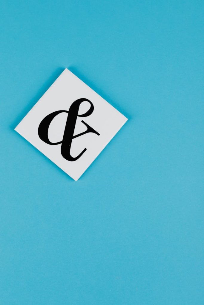
Ampersand on Blue Background

The Essence of Minimalism

Minimalism, as a design philosophy, emphasizes simplicity and functionality. In logo design, this translates to using fewer elements, such as colors, shapes, and text, to create a clear and impactful visual identity. The goal is to strip away any unnecessary details that might distract from the core message of the brand. This approach allows for a more direct communication of values and identity, making it easier for consumers to understand and remember the brand.

Clarity and Recognition

One of the primary benefits of minimalist logos is their ability to achieve clarity. A well-designed minimalist logo can be easily recognized at a glance, which is crucial in today’s fast-moving marketplace. Consider iconic minimalist logos like those of Apple or Nike; they are not only simple but also instantly recognizable. This clarity ensures that the logo can be reproduced across various platforms—whether on a smartphone screen or a billboard—without losing its effectiveness.

Moreover, a minimalist logo often enhances memorability. Research shows that consumers are more likely to remember simple designs, as their brains can process these visuals quickly. This memorability is critical for brands aiming to establish a strong presence in competitive markets.

Timeless Appeal

Minimalist logos tend to have a timeless quality. Unlike trend-driven designs that may quickly become outdated, a minimalist approach focuses on enduring aesthetics. The classic nature of these logos means they can withstand the test of time, allowing brands to maintain consistency in their visual identity over the years. For example, Coca-Cola’s logo has remained relatively unchanged for over a century, showcasing the effectiveness of simplicity.

Versatility Across Platforms

In the age of digital communication, versatility is a must for any logo. Minimalist logos excel in this regard, as their simplicity allows them to adapt seamlessly across various mediums and formats. Whether displayed on a website, social media profile, or promotional material, minimalist logos retain their integrity and effectiveness. This adaptability is essential for brands looking to establish a cohesive identity across different platforms.

Emotional Impact

Minimalism also enables brands to create a stronger emotional connection with their audience. By focusing on essential elements, designers can convey the brand’s values and personality more effectively. For instance, a minimalist logo that uses a single, carefully chosen color can evoke specific emotions, such as trust, excitement, or tranquility, depending on the brand’s message.

Moreover, the simplicity of a minimalist logo can evoke a sense of sophistication and modernity, appealing to contemporary consumers who value clarity and authenticity. Brands that embody these values often find it easier to connect with their audience on a deeper level.

Design Trends and Consumer Expectations

As consumer preferences evolve, so too do design trends. The rise of minimalist logos reflects a broader cultural shift towards simplicity and authenticity. In a world overwhelmed by information, consumers increasingly seek brands that communicate clearly and transparently. Minimalist logos cater to this demand, offering a visual representation of a brand’s commitment to straightforwardness and integrity.

Additionally, as the focus on sustainable and ethical branding grows, minimalist logos can convey a sense of responsibility and mindfulness. Brands that adopt a minimalist aesthetic often reflect their commitment to quality over quantity, appealing to conscious consumers.

Conclusion

Minimalist logos represent a powerful approach to branding in today’s complex landscape. By prioritizing clarity, versatility, and emotional impact, these designs enable brands to communicate their identity effectively and build lasting connections with their audience. As consumer expectations continue to evolve, the relevance of minimalist logos will likely endure, proving that sometimes, less truly is more in the world of branding. For brands looking to make a significant impact, embracing minimalist design principles could be the key to standing out in a crowded marketplace.

Designing a Logo for a New Era: Tips for Modern Brands

In today’s fast-paced and ever-evolving marketplace, a logo is more than just a graphic; it serves as the visual identity of a brand, encapsulating its values, mission, and personality. As brands strive to connect with a diverse audience, the need for a contemporary, memorable logo has never been more critical. Here are essential tips for modern brands looking to design a logo that resonates in this new era.

Time Square, New York during daytime

1. Embrace Simplicity

Simplicity is a cornerstone of modern logo design. A cluttered logo can confuse consumers and dilute brand messaging. Aim for a clean, minimalist design that communicates your brand’s essence at a glance. Think of iconic logos like Apple and Nike, which effectively utilize simplicity to create recognition and recall. A straightforward design can be easily reproduced across various media, maintaining its integrity in both digital and print formats.

2. Focus on Versatility

In an age where brands operate across multiple platforms—social media, websites, merchandise, and more—versatility is key. Your logo should look great on a business card, a billboard, or a smartphone screen. Consider designing variations, such as a horizontal and vertical version, or a simplified icon that can stand alone when necessary. This adaptability ensures your logo remains effective and recognizable regardless of context.

3. Choose the Right Colors

Color plays a crucial role in logo design, as it evokes emotions and associations. Research color psychology to understand how different colors can influence consumer perceptions. For instance, blue often conveys trust and professionalism, while yellow signifies optimism and creativity. Choose a color palette that aligns with your brand values and resonates with your target audience. Additionally, ensure your logo works in both color and monochrome to maintain versatility.

4. Consider Typography Carefully

Typography is an essential element of logo design that can significantly affect a brand’s perception. Choose fonts that reflect your brand’s personality—whether it’s modern and sleek, playful and quirky, or traditional and elegant. Avoid overly trendy fonts that may quickly become outdated. A custom typeface can set your brand apart and add a unique touch to your logo, reinforcing its identity.

5. Incorporate Meaningful Elements

Modern logos often tell a story or convey deeper meaning. Consider incorporating subtle design elements that reflect your brand’s mission or values. For example, the FedEx logo features a hidden arrow symbolizing speed and precision, enhancing the brand’s messaging. These thoughtful details can create an emotional connection with consumers, making your logo more memorable.

6. Stay Relevant with Trends

While timelessness is essential in logo design, being aware of current design trends can help keep your brand feeling fresh and relevant. Trends such as geometric shapes, flat design, and responsive logos are prevalent in contemporary branding. However, be cautious not to chase trends blindly—ensure that any elements you incorporate align with your brand’s core identity and values.

7. Test for Feedback

Before finalizing your logo, gather feedback from a diverse audience. Conduct surveys or focus groups to gauge reactions and perceptions. This step can provide valuable insights and help you identify any areas for improvement. Be open to constructive criticism, as it can lead to a stronger final design that resonates more effectively with your target market.

8. Work with Professionals

If possible, consider hiring a professional designer or agency to bring your logo vision to life. Experienced designers understand the nuances of branding and can guide you through the process, ensuring your logo aligns with industry standards and best practices. Collaborating with a professional can result in a more polished and effective design that meets your brand’s needs.

Conclusion

Designing a logo for a new era requires a thoughtful approach that balances simplicity, versatility, and meaningful design. By embracing these tips, modern brands can create a logo that not only stands out in a crowded marketplace but also resonates deeply with consumers. A well-crafted logo has the power to encapsulate your brand’s identity, foster loyalty, and pave the way for future success.

How to Choose the Right Font for Your Logo

Selecting the right font for your logo is a crucial aspect of branding that can significantly impact how your business is perceived. A well-chosen typeface can convey your brand’s personality, values, and message, while an ill-fitting font can create confusion or misinterpretation. This article explores essential considerations for choosing the right font for your logo, ensuring it aligns with your brand identity and resonates with your target audience.

Paper With the Words Postal Vote in a Typewriter

Understand Your Brand Identity

Before diving into font selection, it’s vital to have a clear understanding of your brand identity. Consider the following questions:

  1. What are your brand values? Identify the core values that define your brand. Are you traditional or modern? Fun or serious? Luxurious or accessible?
  2. Who is your target audience? Understanding your audience’s demographics and preferences will help guide your font choice. A playful font may appeal to a younger audience, while a more classic typeface might resonate with an older demographic.
  3. What message do you want to convey? Different fonts communicate different emotions. A strong, bold font may convey confidence, while a handwritten script may evoke warmth and approachability.

Font Categories

Fonts can be broadly categorized into several types, each with its own characteristics and emotional associations. Familiarize yourself with these categories to help narrow down your options:

1. Serif Fonts

Serif fonts have small decorative strokes at the ends of letters. They are often associated with tradition, reliability, and professionalism. Brands like IBM and The New York Times use serif fonts to convey a sense of authority and credibility.

2. Sans Serif Fonts

Sans serif fonts lack the decorative strokes of serif fonts, offering a cleaner and more modern appearance. They are often associated with simplicity and clarity. Brands like Google and Facebook utilize sans serif fonts to convey a contemporary and approachable image.

3. Script Fonts

Script fonts mimic handwritten text and can evoke a sense of elegance, creativity, or playfulness. They work well for brands that want to communicate warmth and personality, such as wedding planners or artisanal products. However, they can be harder to read in small sizes.

4. Display Fonts

Display fonts are decorative and often unique, making them suitable for logos that want to stand out. They can convey a wide range of emotions, from fun and whimsical to bold and edgy. Use them sparingly to avoid overwhelming your audience.

Readability and Versatility

While it’s essential to choose a font that reflects your brand, readability is paramount. Your logo should be easily recognizable and legible at various sizes and formats. Consider the following:

  1. Test for readability: Ensure that your chosen font is legible at both large and small sizes. It should be clear whether viewed on a website, business card, or billboard.
  2. Versatility: Your logo will be used across various platforms, from digital to print. Choose a font that maintains its integrity in different contexts and backgrounds.

Limit the Number of Fonts

Using multiple fonts in your logo can create visual clutter and confusion. Aim to limit your design to one or two complementary fonts. This approach ensures a clean and cohesive look. If you choose to pair fonts, make sure they have contrasting styles (e.g., a serif with a sans serif) to create visual interest while maintaining harmony.

Consider Customization

If you want your logo to stand out, consider customizing a font or creating a unique typeface. Customization can enhance brand identity and make your logo memorable. Work with a professional designer who can help transform an existing font into something that feels exclusive to your brand.

Test and Gather Feedback

Once you have a few font options, create mock-ups of your logo and test them with your target audience. Gather feedback to understand how different fonts are perceived. Consider conducting surveys or focus groups to gain insights into which font resonates best.

Conclusion

Choosing the right font for your logo is a vital component of your overall branding strategy. By understanding your brand identity, considering font categories, ensuring readability, and gathering feedback, you can select a typeface that effectively communicates your brand’s message and values. A well-chosen font not only enhances your logo’s visual appeal but also fosters a deeper connection with your audience, ultimately contributing to the success of your brand.

How to Create a Logo That Stands the Test of Time

In the fast-paced world of branding, where trends come and go, having a logo that endures is a significant asset for any business. A timeless logo not only captures the essence of a brand but also maintains its relevance and appeal for years to come. This article explores key principles and strategies to design a logo that stands the test of time.

Free stock photo of analyzing, app, background

1. Understand Your Brand Identity

Before diving into the design process, it’s essential to have a clear understanding of your brand’s identity. Ask yourself:

  • What are your brand values?
  • Who is your target audience?
  • What message do you want to convey?

A deep understanding of these elements will help guide your design choices and ensure that the logo reflects your brand accurately. Take the time to articulate your brand’s mission, vision, and personality, as these will serve as the foundation for your logo.

2. Emphasize Simplicity

One of the hallmarks of a timeless logo is simplicity. Complex designs can be visually overwhelming and may not translate well across different mediums. A simple logo is more memorable and versatile, making it easier for audiences to recognize and recall. Consider iconic logos like Apple or Nike; both are characterized by their minimalist designs that convey strong brand identities without unnecessary embellishments.

Tips for Achieving Simplicity:

  • Limit the number of colors used.
  • Choose clean, clear fonts that are easy to read.
  • Avoid intricate details that may be lost in smaller sizes.

3. Choose the Right Color Palette

Color plays a crucial role in how a logo is perceived. Different colors evoke different emotions and associations, making it important to choose a color palette that aligns with your brand identity. For example, blue often represents trust and reliability, while green conveys growth and sustainability.

Principles for Color Selection:

  • Limit your palette: Stick to two or three primary colors to maintain simplicity.
  • Consider versatility: Choose colors that work well in both digital and print formats, including black and white.
  • Think long-term: Avoid colors that are overly trendy, as they may not hold up over time.

4. Select Timeless Typography

Typography is a vital aspect of logo design that can greatly influence its longevity. The right font should be legible, versatile, and reflective of your brand’s personality. Avoid overly stylized or trendy fonts that may quickly become outdated.

Guidelines for Typography:

  • Opt for classic fonts: Serif and sans-serif fonts are often more timeless than decorative ones.
  • Prioritize legibility: Ensure your text is easy to read, even at smaller sizes.
  • Test across formats: Make sure your typography works well in various applications, from business cards to websites.

5. Focus on Versatility

A great logo should be versatile enough to work across different platforms and mediums. Consider how your logo will look in various contexts, such as on social media, merchandise, and print advertising. A logo that can adapt to different backgrounds and sizes without losing its impact is essential for maintaining brand consistency.

Tips for Ensuring Versatility:

  • Design a logo that looks good in full color, monochrome, and black and white.
  • Test the logo in various sizes to ensure it remains recognizable.
  • Create variations of the logo for different applications, such as a horizontal and vertical version.

6. Incorporate Meaningful Symbols

If you choose to include symbols in your logo, ensure they have relevance and meaning connected to your brand. Symbols can enhance your logo’s message and create a deeper emotional connection with your audience. For example, the owl in the logo of a university symbolizes wisdom, reinforcing the institution’s commitment to education.

Best Practices for Using Symbols:

  • Keep it relevant: Choose symbols that reflect your brand’s core values and mission.
  • Avoid clichés: Steer clear of overused symbols that may dilute your logo’s uniqueness.
  • Test for understanding: Ensure that your audience can easily interpret the symbol’s meaning.

7. Seek Professional Guidance

Designing a logo is a complex task that requires expertise in visual communication and branding. If you’re not well-versed in design, consider hiring a professional graphic designer. They can bring your vision to life while ensuring that the final product adheres to design principles that promote longevity.

Benefits of Professional Design:

  • Expertise in branding: Professionals understand how to create logos that resonate with target audiences.
  • Access to resources: Designers have tools and techniques that can enhance the design process.
  • Objective perspective: An external designer can provide valuable insights and feedback on your ideas.

8. Test and Iterate

Once you have a preliminary design, gather feedback from trusted sources, including team members, stakeholders, and potential customers. Testing your logo with real users can provide insights into its effectiveness and appeal. Be open to making adjustments based on feedback, as this iterative process can help refine your logo.

Steps for Testing:

  • Conduct surveys or focus groups to gather opinions on the logo design.
  • Use A/B testing to compare different versions of the logo.
  • Analyze the feedback and make necessary revisions before finalizing the design.

Conclusion

Creating a logo that stands the test of time is a thoughtful process that requires careful consideration of your brand identity, simplicity, color, typography, versatility, and meaningful symbols. By following these principles and seeking professional guidance when needed, you can design a logo that not only resonates with your audience but also remains relevant and impactful for years to come. Remember, a timeless logo is not just a design; it’s a powerful tool that represents your brand’s legacy and future.

The Evolution of Logo Design: Trends Through the Decades

Logo design is a dynamic field that reflects the changing tastes, technologies, and cultural movements of society. From simple symbols to intricate designs, logos have evolved significantly over the years, serving as crucial identifiers for brands. This article explores the evolution of logo design through the decades, highlighting key trends and shifts that have shaped the way brands communicate their identity.

Scattered sheets of white paper covering the entire frame

1920s-1930s: The Birth of Modern Branding

The early 20th century marked the beginning of modern branding, as businesses began to recognize the power of visual identity. Logos during this time were often simple and typographic, focusing on clarity and straightforward messaging. Brands like Coca-Cola and Ford adopted distinctive typefaces that became integral to their identities.

The Art Deco movement also influenced logo design, introducing geometric shapes and bold lines. This period emphasized elegance and sophistication, with logos often adorned with intricate details that reflected the luxurious aspirations of the time.

1940s-1950s: The Rise of Iconography

As the world recovered from the Great Depression and World War II, the 1940s and 1950s saw a shift towards more recognizable iconography in logo design. Brands began incorporating symbols that conveyed their values and mission, making logos more memorable.

For instance, the famous Apple logo was designed during this era, symbolizing innovation and creativity. This period also saw the emergence of brand mascots, like the Pringles’ mustached character, which added personality to brands and fostered a deeper connection with consumers.

1960s-1970s: The Age of Corporate Identity

The 1960s and 1970s marked a significant transition in logo design, as companies began to focus on developing cohesive corporate identities. Designers like Paul Rand pioneered this movement, advocating for simplicity and timelessness in logos. Brands such as IBM and UPS adopted minimalist designs that emphasized clarity and professionalism.

Color theory also became a vital component of logo design. Companies started to recognize the psychological impact of color on consumer perception. For example, blue became synonymous with trust and reliability, while red conveyed excitement and energy. This awareness allowed brands to strategically select colors that resonated with their target audience.

1980s-1990s: The Playful and Experimental Era

The 1980s and 1990s introduced a more playful and experimental approach to logo design. As technology advanced, designers embraced bold colors, abstract shapes, and unconventional typography. This era saw the rise of logos that captured the spirit of youth and innovation, such as the iconic MTV logo.

Additionally, the rise of digital media began to influence logo design. Designers started to create logos that were adaptable across various platforms, anticipating the need for scalability in an increasingly digital world.

2000s: The Shift to Minimalism

As design trends continued to evolve, the 2000s marked a significant shift towards minimalism. Influenced by the rise of user-friendly technology and mobile devices, brands began to prioritize simplicity and functionality in their logos. The flat design trend emerged, characterized by clean lines, limited color palettes, and an absence of gradients and shadows.

Companies like Google and Airbnb adopted minimalist logos that were easy to recognize and reproduce across different mediums. This trend reflected a broader cultural movement towards clarity and efficiency, as consumers sought straightforward solutions in a rapidly changing world.

2010s-Present: The Emphasis on Authenticity and Sustainability

In recent years, logo design has been heavily influenced by the growing demand for authenticity and sustainability. Brands are increasingly seeking to establish emotional connections with their audiences, prompting a return to more handcrafted, artisanal logo styles. This shift reflects a desire for transparency and relatability, as consumers gravitate towards brands that align with their values.

Sustainable practices have also become an integral part of logo design. Many companies are re-evaluating their visual identities to convey a commitment to environmental responsibility. Logos that incorporate organic shapes or earthy color palettes signal a brand’s dedication to sustainability.

Moreover, the rise of social media has changed how logos are perceived and utilized. Logos are now expected to be versatile and adaptable for various digital platforms, from profile pictures to promotional materials. This adaptability ensures that brands maintain a consistent identity across different touchpoints.

Conclusion

The evolution of logo design is a testament to the ever-changing landscape of branding and visual communication. From the straightforward typographic logos of the early 20th century to the minimalist designs of today, logos have continuously adapted to reflect cultural trends, technological advancements, and consumer preferences. As we move forward, it will be fascinating to see how logo design continues to evolve, shaped by new challenges and opportunities in a globalized, digital world. Understanding this evolution not only provides insight into design practices but also highlights the vital role logos play in establishing and maintaining brand identity.

The Process of Logo Design: From Concept to Completion

Designing a logo is a multifaceted process that involves creativity, strategy, and a deep understanding of brand identity. A well-crafted logo serves as the visual cornerstone of a brand, encapsulating its values, mission, and essence. In this article, we’ll explore the comprehensive steps involved in creating a logo, from initial concept to final execution.

person holding pencil near laptop computer

1. Research and Discovery

The first step in the logo design process is thorough research. This phase involves gathering information about the brand, its target audience, and the competitive landscape.

Key Components of Research:

  • Brand Identity: Understand the brand’s mission, vision, and core values. What emotions or messages should the logo convey?
  • Target Audience: Analyze the demographics, preferences, and behaviors of the intended audience. A logo aimed at a younger demographic will likely differ significantly from one targeting professionals.
  • Competitor Analysis: Study competitors’ logos to identify trends and differentiate your design. This helps in avoiding clichés while finding inspiration.

2. Concept Development

Once research is complete, it’s time to brainstorm ideas. This stage involves sketching and exploring various concepts that align with the brand identity.

Techniques for Concept Development:

  • Mind Mapping: Start with keywords related to the brand and visually connect ideas to explore potential themes.
  • Sketching: Rapidly sketch different ideas, focusing on shapes, symbols, and typography without getting bogged down by details.
  • Mood Boards: Create a collection of images, colors, and fonts that capture the desired aesthetic and emotional tone of the logo.

3. Design Exploration

After generating concepts, select the most promising ideas for further refinement. This phase typically involves digital design work.

Steps in Design Exploration:

  • Vector Design: Use design software like Adobe Illustrator to create vector versions of the chosen sketches. This ensures scalability without loss of quality.
  • Typography Selection: Choose appropriate fonts that complement the logo’s overall aesthetic and are legible in various sizes.
  • Color Palette Development: Experiment with color combinations, keeping in mind color psychology and brand alignment. Limit the palette to maintain simplicity.

4. Iteration and Feedback

With initial designs in place, it’s essential to gather feedback. This phase is crucial for refining the logo based on input from stakeholders and potential users.

Gathering Feedback:

  • Present Multiple Options: Show different logo variations to stakeholders for comparison.
  • Seek Diverse Opinions: Gather feedback from team members, clients, and target audience members. Different perspectives can highlight strengths and weaknesses.
  • Make Revisions: Use the feedback to make informed adjustments to the design, enhancing clarity and impact.

5. Finalization

Once the logo design is refined and approved, it’s time for finalization. This stage involves creating multiple formats and variations of the logo for different applications.

Finalization Steps:

  • Create Logo Variants: Develop different versions of the logo, including full color, black and white, and monochrome options. Ensure versatility across backgrounds and sizes.
  • File Formats: Save the logo in various file formats (e.g., AI, EPS, PNG, JPG) to accommodate different use cases, from print to digital media.
  • Establish Guidelines: Create a brand style guide that outlines proper usage, color specifications, and typography guidelines. This ensures consistency across all brand materials.

6. Implementation

With the logo finalized, the next step is implementation. This involves introducing the logo across all brand platforms and materials.

Implementation Strategies:

  • Brand Collateral: Update business cards, letterheads, websites, and social media profiles with the new logo.
  • Promotional Materials: Use the logo in marketing materials, advertisements, and merchandise to establish brand presence.
  • Internal Communication: Share the new logo with employees, emphasizing its significance and proper usage to maintain brand consistency.

7. Evaluation and Adaptation

After implementation, it’s important to monitor the logo’s performance and perception in the market. This phase ensures that the logo continues to resonate with the audience and align with the brand’s evolution.

Evaluation Practices:

  • Gather Feedback: Continue to collect feedback from customers and stakeholders regarding their perception of the logo.
  • Monitor Trends: Stay informed about design trends and consider how they may impact the logo’s relevance in the future.
  • Be Open to Change: If necessary, be prepared to make minor adjustments or a full rebranding to keep the logo aligned with the brand’s growth and market changes.

Conclusion

The logo design process is a journey that requires a combination of creativity, research, and strategic thinking. By following these steps—from research and concept development to finalization and implementation—designers can create logos that not only capture a brand’s essence but also stand the test of time. A well-designed logo is an invaluable asset that communicates the brand’s identity and values, making a lasting impression on its audience. Through careful planning and execution, any brand can achieve a logo that effectively represents its unique story and vision.

Logo Design Mistakes to Avoid: A Guide for Beginners

Creating a logo is a critical step in establishing a brand’s identity. A well-designed logo can help convey your brand’s values, attract customers, and create a lasting impression. However, many beginners make common mistakes that can undermine their logo’s effectiveness. This guide outlines key pitfalls to avoid, ensuring your logo design process is smooth and successful.

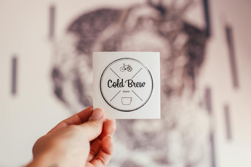
Unrecognizable person demonstrating coffee shop badge with Cold Brew inscription and creative design in hand while standing on blurred background

1. Ignoring Brand Identity

One of the most significant mistakes is failing to align the logo with the brand’s identity. Before starting the design process, it’s essential to define your brand’s values, mission, and target audience. A logo that doesn’t reflect the brand can lead to confusion and misinterpretation. Take the time to understand what your brand stands for, and let that guide your design choices.

2. Overcomplicating the Design

Simplicity is key in logo design. A cluttered logo with too many elements can be overwhelming and difficult to recognize. Great logos are often simple yet memorable, allowing for easy reproduction across various mediums. Aim for a clean design that can be easily scaled and recognized, whether on a business card or a billboard.

3. Relying on Trends

While it’s tempting to follow design trends, they can quickly become outdated. A trendy logo may lose relevance in a short time, necessitating a redesign. Instead, focus on timeless design principles that will ensure your logo remains effective for years to come. Consider classic design elements that convey your brand’s essence without falling victim to fleeting trends.

4. Poor Typography Choices

Typography plays a crucial role in logo design. Choosing the wrong font can send the wrong message about your brand. Avoid overly decorative or hard-to-read fonts, especially for logos that need to convey professionalism. Instead, opt for fonts that are clean, legible, and reflective of your brand’s personality. Mixing too many font styles can also create visual chaos; stick to one or two complementary typefaces.

5. Neglecting Scalability

Your logo will be used in various sizes and formats, from small icons on social media to large banners. If a logo is not designed with scalability in mind, it may lose its integrity when resized. Ensure that your design remains recognizable and legible at any scale. Test your logo at different sizes to ensure it retains its visual impact.

6. Choosing Inappropriate Colors

Color choice is pivotal in logo design, as colors evoke emotions and associations. Beginners often choose colors based on personal preference rather than their psychological impact. Research color theory and consider what emotions different colors evoke in your target audience. Additionally, ensure that your logo works well in both color and monochrome versions for versatility.

7. Forgetting About Versatility

A logo should work across various platforms and mediums. Consider how it will look in print, on the web, and in different backgrounds. A versatile logo is one that can adapt to different contexts without losing its identity. Avoid overly detailed designs that may not reproduce well in certain applications.

8. Not Seeking Feedback

Designing in a vacuum can lead to missed opportunities for improvement. Seek feedback from peers, potential customers, or design professionals throughout the process. Constructive criticism can provide valuable insights that help refine your logo. Be open to suggestions and ready to make adjustments based on feedback.

9. Skipping the Research Phase

Before diving into design, conduct thorough research on competitors and industry standards. Understanding what works and what doesn’t in your field can inform your design choices. Analyze logos from similar brands to identify common elements and differentiate your logo from competitors.

10. Failing to Create Variations

A single logo may not suffice for all brand applications. Consider creating variations of your logo for different contexts, such as a simplified version for small-scale use or a monochrome version for print. Having a suite of logos can enhance your branding flexibility and ensure consistent representation across various platforms.

Conclusion

Avoiding these common logo design mistakes can significantly enhance the effectiveness of your branding efforts. By focusing on brand identity, simplicity, scalability, and versatility, you can create a logo that resonates with your audience and stands the test of time. Remember, a well-designed logo is not just a pretty image; it’s a powerful tool that communicates your brand’s values and connects with your customers. Take your time, seek feedback, and embrace the design process to achieve a logo that truly represents your brand.