The Rise of Variable Fonts: Flexibility in Typography

In the world of typography, few innovations have created as much excitement as variable fonts. These modern, flexible fonts offer designers and developers a new level of control and versatility that was previously unattainable. Traditional fonts, which require separate files for each style or weight, have long been the standard for web and print design. However, with variable fonts, you can access a full range of typographic variations — from weight to width to slant — all within a single font file.

Variable fonts are transforming the way we think about typography in both web and print environments, allowing for more creative expression, improved performance, and a superior user experience. In this article, we’ll dive into what variable fonts are, how they work, and why they’re such a game-changer for designers.
Scattered Letters on Yellow Surface

What Are Variable Fonts?

Variable fonts are a single font file that can contain multiple styles, weights, and widths. Instead of having separate files for bold, italic, light, extra bold, etc., a variable font allows you to access all of these variations in one flexible file. This means that you can adjust the weight, width, and other font properties dynamically, creating a more adaptive and responsive design.

In traditional typography, each font style (e.g., Arial Regular, Arial Bold, Arial Italic) is stored as a separate file. This leads to a more complex workflow for designers, as they have to manage multiple files, and it often increases the load time of websites. Variable fonts address this by consolidating multiple styles into a single, more efficient file.

How Do Variable Fonts Work?

Variable fonts are built on OpenType Font Variations, which allow designers to define a range of values for different font properties such as:

  • Weight: The thickness of the characters.
  • Width: The horizontal stretch or compression of the characters.
  • Slant/Italic: The angle of the characters, which can smoothly transition between upright and italic forms.

Instead of switching between predefined styles, designers can manipulate these properties along a continuous spectrum. For example, you could increase the weight of a font from 300 (light) to 900 (bold) incrementally, allowing for fine-tuned control over the appearance of the text.

Benefits of Variable Fonts

1. Design Flexibility

One of the key advantages of variable fonts is the immense flexibility they provide. Designers are no longer confined to predetermined styles. With variable fonts, you can create unique variations of a typeface that fit your design perfectly. This flexibility allows you to experiment with different weights, widths, and slants, giving you more creative freedom to craft typography that aligns with your brand and design vision.

For instance, on a website, you could adjust the font weight based on screen size, making text heavier on smaller screens for improved readability or lighter on larger screens for a more elegant look.

2. Improved Performance

Because variable fonts consolidate multiple font styles into a single file, they drastically reduce the number of font files that need to be loaded on a website. This not only simplifies the development process but also improves page load times.

Fewer files mean less data for the browser to download, which leads to faster performance, especially on mobile devices. In the age of responsive design, where speed and efficiency are critical to user experience, variable fonts are an excellent solution for optimizing typography without sacrificing design quality.

3. Enhanced Responsiveness

Variable fonts are ideal for responsive design. Since the font properties can change dynamically, you can adjust typography based on screen size, orientation, or even the user’s preferences. This level of adaptability ensures that your website’s typography looks great across all devices, from small smartphone screens to large desktop monitors.

For example, text on a mobile device can automatically adjust to a wider or heavier font to maintain readability, while on larger displays, it can become more slender and sophisticated.

4. Simplified File Management

Managing multiple font styles can be a challenge for designers, especially when working on large-scale projects with complex branding guidelines. Variable fonts simplify file management by condensing all the necessary styles into a single file. This not only streamlines the design process but also reduces the risk of inconsistencies, as all styles are derived from the same base.

5. Finer Control Over Typography

With traditional fonts, you have limited control over the transitions between different font weights or styles. Variable fonts, on the other hand, allow you to fine-tune these transitions. Instead of jumping from a regular to a bold font, you can gradually increase the weight, providing a smoother and more visually appealing transition. This is particularly useful for dynamic interfaces, animations, or any design that benefits from subtle changes in typography.

Applications of Variable Fonts in Web Design

1. Responsive Typography

One of the most exciting uses of variable fonts is in responsive typography. With traditional fonts, you might switch to a different font style or size when designing for smaller screens. Variable fonts allow you to fluidly adjust the font properties, ensuring that text remains legible and visually appealing across different screen sizes.

For instance, as a user resizes their browser window, a variable font can automatically adjust both its width and weight to maintain readability. This adaptability can significantly improve the user experience, especially on mobile devices, where space is limited.

2. Interactive Design Elements

Variable fonts open up new possibilities for interactive design. You can create animations or transitions that change font properties in response to user interactions. For example, as a user hovers over a button, the font could gradually become bolder or wider, adding a subtle but effective layer of interactivity to your design.

Interactive typography can enhance the user experience by providing visual feedback that makes your design feel more responsive and engaging.

3. Improving Branding Consistency

With variable fonts, it’s easier to maintain consistent typography across different platforms and mediums. Whether you’re designing for print, web, or mobile, variable fonts ensure that your brand’s typography remains consistent, regardless of the context. This consistency is crucial for creating a cohesive brand identity that resonates with your audience.

4. Experimentation in Editorial and Web Design

Variable fonts are a playground for creative experimentation. Designers can push the boundaries of traditional typography, creating bold, dynamic, and interactive designs that wouldn’t have been possible with traditional fonts. This is especially valuable in editorial and web design, where engaging typography can draw readers in and make content more compelling.

The Future of Typography with Variable Fonts

As the adoption of variable fonts grows, we can expect to see even more creative uses of this technology. The ability to manipulate typography in real-time, combined with the performance benefits of fewer font files, makes variable fonts an essential tool for modern web and graphic design.

From improved performance to enhanced creative freedom, variable fonts are paving the way for the future of typography, allowing designers to create more adaptive, engaging, and visually stunning designs that cater to the diverse needs of users across all platforms.

Conclusion

Variable fonts represent a significant leap forward in the world of typography, offering unparalleled flexibility, performance improvements, and creative possibilities. Whether you’re designing for the web, print, or mobile, variable fonts allow you to create unique, responsive, and dynamic typographic experiences that enhance your design while maintaining brand consistency.

For designers looking to stay ahead of the curve, embracing variable fonts is not just a trend—it’s the future of typography. By incorporating variable fonts into your design toolkit, you can create more adaptable, visually striking, and efficient designs that stand out in today’s digital landscape.
Typography for Social Media: Engaging Your Audience Through Type

In the rapidly evolving landscape of social media, visual communication plays a pivotal role in capturing audience attention. Among the various elements that contribute to effective visual communication, typography stands out as a powerful tool. The right choice of fonts and typographic styles can enhance your brand message, foster engagement, and establish a cohesive identity across platforms. In this article, we’ll explore the importance of typography in social media, discuss best practices, and provide tips for leveraging type to engage your audience effectively.

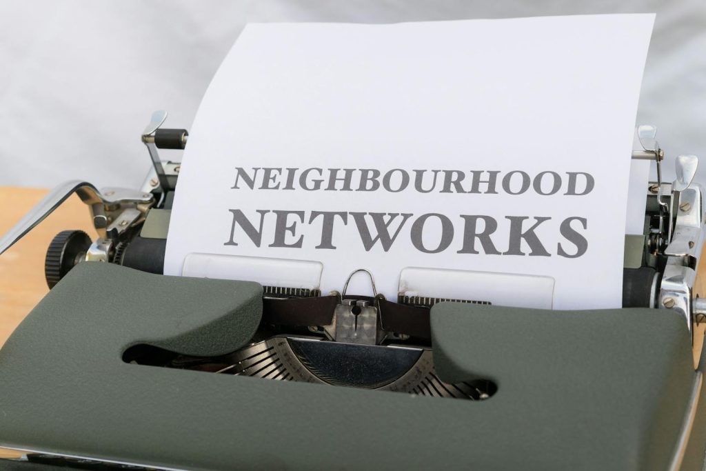
A typewriter with a paper that says neighborhood networks

The Role of Typography in Social Media

Typography is not merely about choosing a font; it’s about creating a visual hierarchy, conveying emotion, and enhancing readability. In a social media environment where users scroll rapidly through content, effective typography can make your posts stand out and convey your message instantly.

1. Establishing Brand Identity

Your choice of typeface can significantly influence how your brand is perceived. Fonts carry connotations; for example, a bold, modern sans-serif can suggest innovation, while a classic serif may evoke tradition and trust. By consistently using specific fonts across your social media channels, you reinforce your brand identity and make your posts instantly recognizable.

2. Enhancing Readability

Social media platforms often prioritize visual content, and the average attention span of users is notoriously short. Ensuring that your typography is legible at various sizes and on different devices is crucial. Choose fonts that are easy to read, even at a glance, and consider factors like letter spacing, line height, and contrast against the background.

3. Creating Emotional Connections

Different fonts evoke different emotions. For instance, script fonts can convey warmth and personal touch, while geometric fonts may exude professionalism and modernity. By aligning your typographic choices with the emotions you want to evoke, you can create a deeper connection with your audience.

Best Practices for Typography on Social Media

1. Limit Font Choices

While it may be tempting to use multiple fonts for variety, sticking to two or three complementary typefaces is generally more effective. This not only enhances visual cohesion but also prevents your posts from looking cluttered. For instance, you might use a bold typeface for headlines and a simpler sans-serif for body text.

2. Use Hierarchy Wisely

Establishing a clear visual hierarchy helps guide the viewer’s eye and emphasizes important information. Use size, weight, and color to differentiate headings, subheadings, and body text. This organization helps users quickly grasp the key messages in your posts.

3. Consider Platform Specifications

Each social media platform has its own specifications regarding image sizes and text visibility. Ensure your typography is optimized for these specific dimensions. For example, text that looks great on Instagram may not be as readable on Twitter or Facebook due to different image formats.

4. Incorporate Brand Colors

Integrating your brand colors with your typography can enhance recognition and consistency. Use contrasting colors for text to ensure readability while still staying true to your brand’s aesthetic. A well-designed color palette combined with thoughtful typography can elevate your posts significantly.

5. Experiment with Layouts

Different layouts can dramatically change how your typography is perceived. Experiment with text placement, alignment, and spacing to create visually appealing posts. Consider using techniques such as text overlays on images or creative placements to make your content more engaging.

6. Utilize Templates

Creating templates with predefined typography styles can save time and ensure consistency across your posts. Tools like Canva or Adobe Spark allow you to design templates that align with your brand’s typography, making it easier to produce cohesive content quickly.

7. Test for Performance

Lastly, always analyze the performance of your posts. A/B testing different typographic styles can provide insights into what resonates with your audience. Pay attention to engagement metrics and adjust your typography based on what works best.

Engaging Your Audience Through Typography

1. Call to Action (CTA)

Effective typography can enhance your calls to action. Use bold or contrasting fonts to draw attention to CTAs. Phrasing and positioning are also important; make sure your CTA stands out visually and encourages users to take action.

2. Creating Memorable Quotes

Typography can play a vital role in making quotes shareable. Use larger, eye-catching fonts and consider adding a design element, such as a background color or graphic, to emphasize the quote. This not only engages your audience but also encourages shares and re-posts.

3. Highlighting Key Information

Whether you’re sharing tips, facts, or statistics, using typography to highlight key information can make your content more digestible. Bullet points, bold text, or colored sections can break up dense information, making it more engaging for users.

4. Seasonal and Trendy Typography

Keeping your typography fresh and relevant can engage your audience effectively. Incorporate seasonal themes or trending styles in your posts to catch the eye of followers. For example, using festive fonts during holiday seasons can create a timely and relatable connection with your audience.

Conclusion

Typography is a fundamental yet often overlooked aspect of social media design. By understanding the power of type and applying best practices, you can enhance your brand’s visual identity, improve readability, and create emotional connections with your audience.

Engaging your audience through effective typography not only makes your posts stand out but also contributes to a stronger brand presence in the crowded social media landscape. As you refine your approach to typography, remember that the ultimate goal is to communicate your message clearly and engagingly. By mastering the art of typography, you can elevate your social media strategy and connect with your audience on a deeper level.

The Art of Typography: A Comprehensive Guide for Designers

Typography is a vital component of design that goes beyond mere aesthetics. It serves as a bridge between the message and its audience, shaping perceptions and evoking emotions. For designers, mastering the art of typography is crucial for creating compelling and effective communication. This comprehensive guide will explore the principles, techniques, and considerations that make typography an essential skill in the design toolkit.

Person Holding Don't Spoil the Scene Card

Understanding Typography

At its core, typography involves the arrangement of text in a way that is visually appealing and easy to read. It encompasses font selection, size, spacing, alignment, and color. The goal of typography is to enhance readability and convey meaning while aligning with the brand’s voice and identity.

The Anatomy of Type

To effectively utilize typography, designers should be familiar with the anatomy of type. Key elements include:

  • Ascender: The part of a lowercase letter that extends above the x-height (e.g., the top of ‘b’ or ‘d’).
  • Descender: The portion of a lowercase letter that extends below the baseline (e.g., the bottom of ‘g’ or ‘y’).
  • X-height: The height of the lowercase letters, excluding ascenders and descenders.
  • Baseline: The imaginary line on which text sits.
  • Cap height: The height of uppercase letters.

Understanding these components allows designers to analyze and select typefaces more effectively.

Choosing the Right Typeface

The choice of typeface is foundational to effective typography. Designers should consider several factors when selecting fonts:

1. Purpose and Context

Different typefaces convey distinct emotions and messages. Serif fonts, characterized by their small lines or decorations at the ends of strokes, often exude tradition and reliability, making them ideal for formal contexts. Sans-serif fonts, with their clean lines and modern appearance, are suited for contemporary designs and digital interfaces.

2. Readability and Legibility

Readability refers to how easily text can be read in larger blocks, while legibility focuses on individual letter recognition. For body text, opt for typefaces that enhance both readability and legibility. A good rule of thumb is to choose a font size that is comfortable for reading, typically between 10-12 points for print and slightly larger for digital content.

3. Font Pairing

Combining different typefaces can create visual interest and hierarchy in designs. However, pairing fonts requires a delicate balance. A common approach is to pair a serif font with a sans-serif font, creating contrast while maintaining harmony. Consider using a primary typeface for headings and a complementary one for body text to establish a clear visual hierarchy.

Hierarchy and Structure

Effective typography relies on hierarchy to guide readers through content. Hierarchy helps to organize information and highlight key messages. Designers can establish hierarchy through:

1. Size

Larger font sizes draw attention and indicate importance. Use varying sizes for headings, subheadings, and body text to create a clear structure.

2. Weight

Font weight refers to the thickness of the characters. Bolder weights can emphasize specific content, while lighter weights can create a sense of elegance or subtlety.

3. Color and Contrast

Color plays a crucial role in typography. High contrast between text and background enhances readability. Designers should choose colors that align with the brand’s palette and evoke the desired emotional response.

Spacing Matters

Proper spacing is essential for achieving well-balanced typography. This includes:

1. Line Spacing (Leading)

Leading refers to the vertical space between lines of text. Adequate leading improves readability, especially in long paragraphs. A common guideline is to set leading to 120-145% of the font size.

2. Letter Spacing (Tracking)

Tracking adjusts the spacing between all characters in a text block. Tight tracking can create a sense of urgency, while loose tracking offers a more open and airy feel. Use tracking judiciously to maintain legibility.

3. Kerning

Kerning is the adjustment of space between specific pairs of letters to achieve visual balance. Proper kerning prevents awkward gaps and ensures a polished appearance. Many design software programs include automatic kerning features, but manual adjustments may be necessary for optimal results.

Typography in Branding

Typography plays a pivotal role in branding. A well-chosen typeface can communicate a brand’s personality, values, and industry. Consider these aspects when integrating typography into branding:

1. Consistency

Consistency in typography across all branding materials reinforces brand identity. Use the same typefaces for logos, websites, and marketing materials to create a cohesive visual language.

2. Unique Typography

Custom typefaces can set a brand apart from competitors. A unique font adds a distinctive flair to branding and can become an integral part of the brand identity.

3. Emotional Connection

Different typefaces evoke various emotions. For instance, rounded typefaces may convey friendliness, while angular fonts can suggest strength. Select typefaces that align with the brand’s emotional message to enhance the connection with the audience.

Conclusion

Typography is an art that blends creativity with functionality. By understanding the fundamentals of type anatomy, selecting the right typeface, establishing hierarchy, and paying attention to spacing, designers can elevate their work and create compelling visual narratives. In a world where communication is increasingly visual, mastering the art of typography is not just beneficial—it’s essential for effective design. As trends evolve, designers must continue to explore, experiment, and refine their typography skills to create impactful and memorable designs that resonate with their audiences.

Iconic Typefaces and Their Impact on Modern Design

Typography is a foundational element in design, with certain typefaces having a lasting influence on visual culture, branding, and communication. Iconic typefaces have shaped the way we perceive content, helping convey tone, emotion, and professionalism. In modern design, the right typeface can create a distinctive and timeless aesthetic, influencing everything from web design to branding. This article explores some of the most iconic typefaces and their impact on modern design practices.

Empire State Building near multistage houses against ocean

Helvetica: The King of Neutrality

Perhaps the most iconic typeface of all time, Helvetica was created in 1957 by Swiss designer Max Miedinger. It became a symbol of the modernist movement, embodying simplicity, clarity, and neutrality. Helvetica’s clean, sans-serif design made it the go-to choice for corporate branding, signage, and editorial design.

Impact on Modern Design:

  • Branding: Companies like American Airlines, Toyota, and Microsoft have used Helvetica to communicate reliability and professionalism. The typeface’s versatility allows it to fit in with both traditional and modern design aesthetics.
  • Minimalism: Helvetica’s neutral and uncluttered design has made it a favorite for minimalist design, which is a dominant trend in modern web and UX design. Its ability to be both elegant and functional without distracting from the message is key to its longevity.
  • Web Design: With the rise of digital interfaces, Helvetica continues to be a popular choice in UI design for its legibility across devices and screen sizes.

Times New Roman: Tradition and Authority

Originally commissioned by the British newspaper The Times in 1931, Times New Roman is a serif typeface that has come to represent authority and tradition. It was designed by Stanley Morison and quickly became the standard for print and academic documents.

Impact on Modern Design:

  • Academic and Editorial Design: Times New Roman has long been the standard in academic and editorial publishing, symbolizing credibility and formality. Even as web fonts became popular, Times New Roman remained a familiar and trusted choice for long-form content.
  • Corporate and Legal Use: Many companies, law firms, and government agencies still use Times New Roman for official documents, as it conveys professionalism and gravitas.
  • Digital Transformation: Despite its print origins, Times New Roman has transitioned into the digital world, being used in various digital platforms for its readability and formal tone.

Futura: The Typeface of the Future

Designed by Paul Renner in 1927, Futura is a geometric sans-serif typeface that epitomizes the Bauhaus movement’s design philosophy. With its clean, almost mathematical forms, Futura embodies modernism and progress, making it a popular choice for contemporary brands and designers.

Impact on Modern Design:

  • Branding and Advertising: Futura’s geometric, forward-thinking appearance has made it popular in branding for companies that want to convey innovation and progress. Brands like IKEA and Volkswagen have used Futura in their visual identity.
  • Editorial and Print Design: Futura’s sharp edges and balanced forms make it a popular choice for editorial design, particularly in fashion and art publications. It gives layouts a sleek, modern look.
  • Cinematic Use: Futura has been used in iconic films like 2001: A Space Odyssey and American Beauty, helping to create futuristic and sleek atmospheres.

Garamond: The Classic Serif

One of the oldest typefaces still in use today, Garamond was first created in the 16th century by French type designer Claude Garamond. Its elegant and timeless serif design has made it a favorite in book publishing and academic work.

Impact on Modern Design:

  • Book Publishing: Garamond’s graceful and easy-to-read style makes it a favorite for book publishers, particularly for literary works. Its classic look enhances the sense of tradition and authority.
  • Design Elegance: Garamond offers a sense of refinement, making it suitable for high-end brands and design projects that want to exude sophistication. It pairs well with both contemporary and traditional design elements.
  • Readability: In the digital age, Garamond continues to be popular in long-form content due to its readability, especially in body text.

Gill Sans: The Humanist Sans-Serif

Gill Sans, designed by Eric Gill in 1928, is a humanist sans-serif typeface that offers a more friendly and approachable feel than geometric typefaces like Futura. It combines clarity with a sense of warmth, making it popular in a variety of design contexts.

Impact on Modern Design:

  • Public and Institutional Use: The British Railways and the BBC famously used Gill Sans in their signage and logos. Its humanist qualities made it approachable yet authoritative.
  • User-Friendly Interfaces: In the era of user-centered design, Gill Sans offers readability with a human touch, making it popular in UX/UI design. Its softer edges are seen as more welcoming than sharper, more mechanical typefaces.
  • Branding Versatility: Many modern brands appreciate Gill Sans for its versatility. It can be both professional and informal, depending on the context, making it a strong candidate for contemporary logos and corporate identities.

Bodoni: The Typeface of Elegance

Designed by Giambattista Bodoni in the late 18th century, Bodoni is a serif typeface characterized by its high contrast between thick and thin strokes, creating a sense of drama and sophistication. It’s often associated with luxury brands and fashion houses.

Impact on Modern Design:

  • Luxury and Fashion: Bodoni’s dramatic flair and elegant forms have made it a go-to choice for luxury brands like Vogue, creating a sense of exclusivity and high fashion.
  • Editorial and Print Design: Bodoni is frequently used in magazine headlines and editorial spreads due to its striking appearance. It commands attention while maintaining an air of sophistication.
  • Modern Applications: While Bodoni was designed centuries ago, its high-contrast, modernist appearance has allowed it to remain relevant in both digital and print applications, especially in high-end branding.

Conclusion: The Timelessness of Iconic Typefaces

Iconic typefaces like Helvetica, Times New Roman, Futura, Garamond, Gill Sans, and Bodoni have not only stood the test of time but have also shaped the course of modern design. Their versatility, readability, and aesthetic appeal continue to make them relevant in today’s design world, from branding and advertising to web design and print.

These typefaces demonstrate that good typography transcends trends, offering functionality and beauty that can adapt to different mediums and design needs. Understanding their impact and history can help designers make informed choices when selecting typefaces for their own projects, ensuring that their designs are not only visually appealing but also timeless.

Common Typography Mistakes to Avoid in Your Designs

Typography is a vital element of design that can significantly influence how a message is perceived. Whether you are creating a logo, a website, or social media graphics, effective typography can enhance readability, evoke emotions, and strengthen brand identity. However, many designers—both novice and experienced—make common typography mistakes that can undermine their work. In this article, we’ll explore these pitfalls and provide guidance on how to avoid them.

Close-Up Shot of Scrabble Tiles on a White Surface

1. Ignoring Readability

One of the most critical aspects of typography is readability. A common mistake is choosing overly decorative or complex fonts that are difficult to read, especially at smaller sizes.

Solution: Prioritize clarity over style. Always ensure that your chosen fonts are legible across various sizes and platforms. Test your designs in different contexts to confirm that they are easily readable.

2. Overusing Fonts

Using too many different fonts in a single design can create a chaotic and disorganized appearance. This often leads to a lack of visual coherence and makes it challenging for viewers to focus on the content.

Solution: Stick to two or three complementary fonts. For example, you might use one font for headings and another for body text. This approach maintains visual harmony and makes your designs more professional.

3. Poor Hierarchy

Establishing a clear hierarchy helps guide the viewer’s eye and emphasizes the most important information. A frequent mistake is using similar font sizes or weights for all text, which can confuse readers about what to focus on.

Solution: Use different sizes, weights, and colors to create a clear visual hierarchy. Headlines should stand out, while subheadings and body text should follow in decreasing importance.

4. Neglecting Line Spacing

Line spacing, or leading, plays a crucial role in readability. Too little space between lines can make text feel cramped, while too much can disrupt flow.

Solution: Use appropriate line spacing to enhance readability. A good rule of thumb is to set your line height to around 1.5 times the font size for body text. This balance can significantly improve readability.

5. Color Confusion

Choosing colors for text and backgrounds that lack sufficient contrast can lead to readability issues. Light text on a light background or dark text on a dark background can make it difficult for viewers to engage with your content.

Solution: Ensure there is adequate contrast between text and background colors. Tools like contrast checkers can help you verify that your color combinations meet accessibility standards.

6. Misusing Fonts for Emphasis

Using bold, italic, or all-caps styles for emphasis is common, but overusing these styles can diminish their effectiveness.

Solution: Use font styles judiciously. Reserve bold or italic for specific instances where you want to draw attention, rather than applying them liberally across your text.

7. Inconsistent Font Styles

Inconsistency in font choices across different materials can confuse audiences and dilute brand identity.

Solution: Establish a typography style guide that outlines which fonts to use and when. Consistency helps reinforce your brand’s visual identity and makes your materials look cohesive.

8. Failing to Consider Legibility on Different Devices

With users accessing content across a variety of devices, a font that looks great on a desktop may not translate well to mobile screens.

Solution: Always preview your designs on multiple devices. Responsive design techniques can help ensure that your typography remains legible and appealing, regardless of the screen size.

9. Overly Complicated Text Effects

While text effects like shadows, outlines, and gradients can enhance designs, overusing them can make text look cluttered and distracting.

Solution: Use text effects sparingly. Focus on subtle enhancements that complement the text rather than overwhelm it. Often, a clean and straightforward approach is more effective.

10. Ignoring Brand Voice

The choice of typography should reflect the brand’s voice and personality. Using fonts that do not align with the brand’s image can create a disconnect with the audience.

Solution: Select fonts that embody the essence of your brand. Whether you want to convey elegance, modernity, or playfulness, ensure your typography aligns with your overall brand message.

Conclusion

Typography is a powerful tool in the design arsenal, and avoiding common mistakes can significantly enhance your work. By prioritizing readability, establishing a clear hierarchy, maintaining consistency, and ensuring appropriate font choices, you can create designs that engage and resonate with your audience. Remember, effective typography is not just about selecting beautiful fonts—it’s about conveying messages clearly and effectively. By being mindful of these common pitfalls, you can elevate your designs and leave a lasting impression.